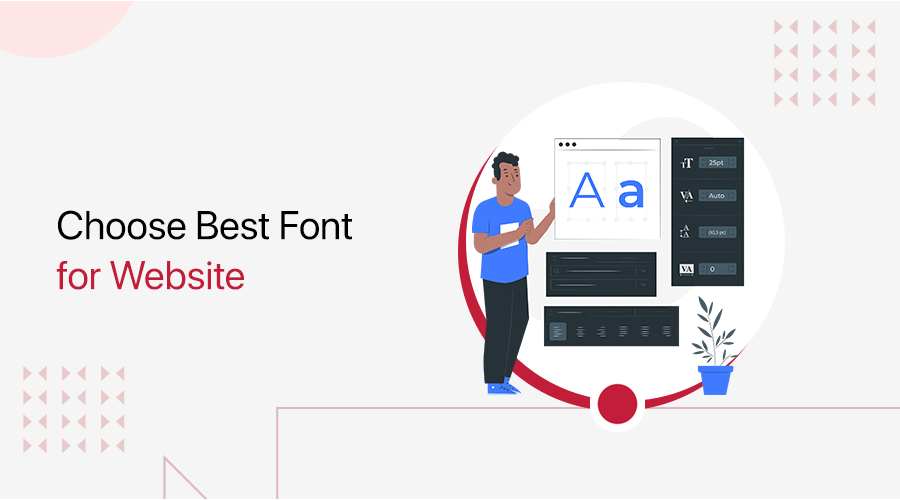
Do you want to know how to choose best font for your website? Or want to learn how to combine fonts effectively? If yes, then here we go!
In today’s digital world, where people quickly decide if they like something, your website’s fonts are really important. They can either help your website do well or not do so well.
Choosing the right font for your website is a big decision. The fonts you pick can really change how your website looks and how easy it is to read.
In this comprehensive guide, we’ll go through important things to think about when picking fonts. It’ll help you make smart choices for your website. Let’s get started and make sure your website looks great and conveys your message to your audience in the right way.
IN THIS GUIDE
hide
A. Which is Correct – Font or Typeface?
The terms “font” and “typeface” are commonly used interchangeably. However, they refer to significantly different features of typography. Understanding what each phrase means is essential for defining the difference.

In a nutshell, a typeface is a set of characters with a consistent visual appearance. A specific design family consists of different letter, number, and symbol forms, styles, and variations.
Arial, Helvetica, and Times New Roman are a few examples of different typefaces. There are many different types of typefaces, including bold, italic, regular, and others.
A font is a specific application or realization of a typeface. A font is a set of specific-size and styled characters from a typeface family, stored in digital or physical form.
For instance, the Arial typeface family includes fonts like Arial Bold at 12 points and Arial Regular at 14 points.
To put it simply, a typeface is like a family name, while a font is an individual member of that family. Typefaces establish the overall design and character styles of a set of characters. Fonts determine the specific size and style of those characters within the chosen typeface.
Understanding the distinction between typefaces and fonts remains valuable. This knowledge is particularly essential for designers and typographers who require precision in diverse design projects.
In summary, “font” is a common term for typefaces in everyday language. However, “typeface” is the more precise term used to describe the overall design of a character set. “Font” specifically relates to the style and size of characters within that typeface family.
Hence, both terms are crucial in typography and design. Attention to detail in their usage significantly affects a project’s visual and communicative effectiveness.
B. What is Typography? – Overview
Typography is a fundamental element of graphic design and communication. It’s the art of arranging typefaces, fonts, and characters to create visually appealing and meaningful designs.
Indeed, it plays a pivotal role in conveying information. It also helps set the tone and evoke emotions in various written and visual communication forms. These forms include print materials, websites, advertising, and more.
Typography encompasses a wide range of elements. These elements include typefaces, fonts, line spacing, character spacing, alignment, and hierarchy. All of these components work together to create a harmonious and effective composition.
One of the primary objectives of typography is to enhance readability and legibility. Choosing fonts that are easily read in different situations and sizes is important for good design. The type of font you choose affects how a design looks and what it says, as each font has its own style and emotion.
In addition to enhancing readability and aesthetics, typography can also convey meaning and hierarchy. Designers can emphasize words or phrases by utilizing font styles, sizes, and colors. They can also highlight essential information.
Additionally, they can create a visual hierarchy that guides the reader’s attention. This hierarchy helps users navigate and understand the content more easily.
Typography changes with technology and design trends. It’s now more versatile and adaptable with digital media and responsive web design.
As a result, typography remains a crucial element in the world of design. It enables effective communication and visual storytelling across various media platforms.
C. Types of Typefaces
Fonts, usually referred to as typefaces exist in a variety of styles and categories. Each typeface has distinctive qualities that allow it to convey a variety of feelings, ideas, and messages. Here are a few popular font categories:
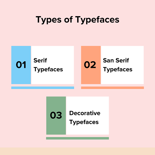
Serif Typefaces
Serif typefaces are fonts that have little decorative lines, called “serifs,” at the ends of the main lines in each letter. These serifs create a classic and traditional look.
Serif fonts are available in several styles. These styles include old-style serifs, which feature moderate contrast between thick and thin strokes. There are also transitional serifs with sharp serifs and more contrast.
Additionally, modern (Didone) serifs are known for their high contrast and thin serifs. Slab serifs, on the other hand, are recognized for their thick and blocky serifs.
These fonts are frequently chosen for the main text in items like books and newspapers because they’re easy to read. They also have a timeless and classic appearance.
These fonts make things look official and important, so people use them for many different things, like official papers and school books. In contrast to sans-serif fonts, serif typefaces are known for their elegant and timeless appearance.
San Serif Typefaces
Sans-serif typefaces are fonts without the little decorative strokes, or “serifs,” at the ends of letters. These fonts have clean, simple lines without additional embellishments.
Sans-serif fonts are often perceived as modern, clean, and straightforward. They’re commonly used for headlines, signage, digital screens, and other instances where a sleek and contemporary appearance is desired.
Likewise, they come in various styles. Grotesque sans-serif fonts are simple and plain, while humanist sans-serif fonts have shapes that look more like handwriting. Geometric sans-serifs are based on geometric forms for a minimalist look.
The absence of serifs in sans-serif typefaces can enhance readability on screens and at smaller sizes. People like using them because they make things look modern and casual, which is why they’re often used for websites and digital stuff.
Decorative Typefaces
Decorative typefaces, often called display typefaces, are fonts created with unique and ornamental styles. They are primarily used for decorative or attention-grabbing purposes rather than for long paragraphs of text.
These typefaces often include one-of-a-kind and artistic letter shapes. They’re a great choice for headers, logos, posters, and other design elements where a strong visual impact is crucial.
Decorative fonts can look very different from each other. Some may be elegant and look like fancy handwriting, while others are bold and unusual. People pick them to create certain feelings or looks in their designs and make everything look better.
Art Deco fonts look like they’ve got a lot of cool shapes and luxury, inspired by the Art Deco style. On the other hand, blackletter fonts make things seem very old and fancy like they’re from a long time ago.
Decorative typefaces are great for adding creativity and character to design projects. However, they’re usually not a good choice for long paragraphs because their complex and eye-catching designs can make text harder to read.
D. The Impact of Typography on User Experience and Readability
Typography greatly influences a website’s readability and user experience (UX). It has a variety of components, including font varieties, font sizes, line breaks, line lengths, contrast in color, and more.
Together, these factors affect how visitors view and engage with the content on your website. Here’s an in-depth look at how typography affects readability and the user experience:
- First Impressions – Typography is the initial impression on a website, influencing its tone and user perception. Carefully chosen fonts can convey professionalism, creativity, and trustworthiness for a positive impact.
- Readability – Readability is crucial for a positive user experience, achieved through appropriate font choices and sizes. Sans-serif fonts like Arial and Helvetica are commonly preferred for screens, while serif fonts like Times New Roman are favored in print.
- Content Scannability – Users scan web content and rely on typography techniques like bolding, italics, and font size variation for emphasis. Clear subheadings and bullet points enhance user efficiency in quickly finding desired information.
- Mobile Responsiveness – Responsive typography is vital due to increased smartphone and tablet usage. It ensures readability and comfort on all devices by smoothly adjusting font sizes and spacing for various screen sizes.
- Color Contrast – For readability and accessibility, there must be a strong color contrast between the text and the background. For people with vision difficulties or when seen in poor lighting, low contrast can make text difficult to read.
- Loading Speed – Font selection can affect a website’s loading speed, especially when using externally hosted web fonts. To ensure a fast user experience, optimize font delivery methods and limit the number of font variations used.
- Branding – Typography also plays a role in branding. Consistent use of specific fonts and styles can reinforce a website’s identity and make it more memorable. A unique and well-chosen font can become part of a brand’s visual signature.
- Accessibility – Accessibility is a critical aspect of UX. Proper typography choices, such as font size, spacing, and contrast, are crucial. They ensure that all users, including those with disabilities, can access and understand website content effectively.
In conclusion, typography is a powerful tool for enhancing the user experience and readability of a website. Intelligent typography improves usability and accessibility in digital design, making it a crucial factor for a satisfying user experience.
E. How to Choose Best Font for Your Website?
Now that we know what typography is and some of the major types of typefaces. The right font selection is essential for a website’s user experience and overall design consistency.
Let’s get started with some advice on how to choose the best font for websites.
Identify Your Target Audience
Identifying your target audience is a pivotal step in choosing the best font for your website. The characteristics and preferences of your audience are key factors in choosing a font that is appealing to them.

The particular group of people you want to interact with through your website is your target audience. Start by understanding their demographics, interests, and behaviors in order to select the best font.
Consider factors such as age, gender, location, industry, and cultural background. If your website is for young, tech-savvy gamers, choose bold and modern fonts like “Oswald” or “Exo.” These fonts align with their preferences and reflect the dynamic nature of the gaming industry.
To understand how your audience interacts with your content, analyze user behavior and expectations on your website. You can also conduct market research for deeper insights. Are they looking for educational content, conducting product searches, or just browsing for fun?
A financial website may choose a standard and serious font like “Times New Roman” to show that it’s trustworthy and professional.
Knowing who visits your site and what they like is important for picking fonts that work well and say what you want. These considerations lead to enhanced user engagement and a more personalized and appealing web experience.
Define Your Brand Identity
Defining your brand identity is a crucial step in selecting the best font for your website. Thus, choose fonts that match your brand’s personality, values, and message for the right online presence.

- Personality and Values – Establish the personality and values of your brand first. Is your business’s brand casual and serious or creative and playful? Are innovation, tradition, reliability, or sustainability more important to you than anything else?
For instance, if your brand is modern and innovative, then fonts like “Avenir” or “Lato” convey forward-thinking and minimalism effectively. - Consistency – Consistency is key to brand identity. From your website to your marketing brochures, all elements that represent your brand should use the same fonts.
Suppose you’re running a luxury fashion brand. For a luxury fashion brand, using “Playfair Display” for headings and “EB Garamond” for body text ensures sophistication and consistency. - Message and Audience – Think about your target audience and the message you want to express. If your message emphasizes affordability and accessibility, then fonts like “Roboto” or “Open Sans” are suitable choices.
They convey clarity and approachability, making them ideal for a budget-friendly brand targeting a broad audience. - Visual Appeal – Fonts should visually appeal to your audience. A wellness and health-oriented brand may opt for rounded, friendly fonts like “Quicksand” or “Comfortaa”. These fonts evoke a sense of well-being and approachability.
Therefore, defining your brand identity through personality, values, and messaging is integral to font selection. When your fonts match your brand’s style and stay the same, your website looks put-together and interesting. It helps your brand’s identity shine through and connect with your audience.
Readability and Legibility
Readability and legibility are critical factors to consider when selecting the best font for your website. They significantly impact how easily visitors can consume your content and navigate your site.
Let’s dive into these factors and their importance, using examples to illustrate their effects.
Readability:
Readability refers to how comfortably users can read and comprehend your website’s content. It involves factors like font size, spacing, and line length.
For example, if you opt for a small font size, then it can make your text hard to read. Insufficient line spacing worsens this issue, leading to reader frustration and potentially causing them to leave your site.
Imagine a website that uses a tiny, tightly-spaced font for its paragraphs. People would have a tough time reading it, and they might leave your site for one that’s easier to read.
Legibility:
However, legibility emphasizes the clarity and distinctiveness of each individual character within a font. It involves features like serif presence, stroke thickness, and letterform design.
A font with poor legibility can have characters that look too similar, making it hard to distinguish individual letters. This, in turn, can make it difficult for readers to recognize words.
Example: Consider a website that uses a decorative script font for its main navigation menu. While the font may look artistic, it might make it tough for users to quickly see what’s on the menu.
To strike the right balance between readability and legibility, you should consider your website’s purpose and audience. For instance, a news site for a wide audience might choose Arial or Helvetica for legibility and modern style.
On the other hand, a niche fashion blog might select a decorative font for its logo or headers to express a unique style. However, it would use a readable sans-serif or serif font for the main text.
Therefore, the choice of font on your website should prioritize the user experience. Pick fonts that make text easy to read and menus/headings clear on your website, especially for lots of content.
A well-balanced approach will make your website more accessible and engaging for visitors, ultimately contributing to its success.
Choose Font Hierarchy
Here’s a straightforward suggestion: Keep your website to just three fonts or less. This practice enhances your site’s design and readability. Additionally, limiting the number of fonts improves website accessibility.
When incorporating multiple fonts on your website, consider choosing a primary font and a secondary font, along with an optional accent font. This approach helps ensure variety and consistency in your typography.
You can also use a font family where each font looks a little different but still goes well together. These different fonts work well together across your website, making it look neat and pleasing to the eye.
These strategies keep your website’s text looking good and balanced while avoiding a confusing mix of fonts.
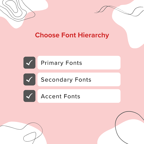
a. Primary Fonts
Your primary font holds a special place in your website’s design. It’s the font that takes the spotlight, prominently featured in headers, titles, and other key elements. This font leaves a lasting impact on visitors as a visual representation of your brand.
The primary font is the one most closely linked with your brand identity, even if you don’t use it frequently. Its distinctive nature establishes the tone for your website and provides a unique user experience.
The primary font serves as a key element of brand recognition. Its unique style and usage convey your brand’s personality and message. Whether it looks modern and simple or elegant and classic, this font is super important for how your website looks.
Therefore, choosing the proper primary font is crucial since it affects how people view and remember your brand.
b. Secondary Fonts
The secondary font takes on a practical role on your website. It’s the font that does most of the writing job, like for paragraphs, descriptions, blog articles, and stuff like that.
Unlike the main font which can grab attention with its unique style, the secondary font focuses on one important thing: readability.
Readability is important since your audience has to be able to easily understand and comprehend the information you provide. Fancy or complicated fonts might look nice in small bits, but they can be hard to read when used a lot in long paragraphs.
You can make sure that the content is readable and user-friendly by selecting a secondary font. Visitors can effortlessly interact with your content without having to strain their eyes.
This combination consists of a visually striking primary font. It also includes a highly readable secondary font, and together, they create a balanced and effective typographic experience. This, in turn, enhances the overall quality of your website.
c. Accent Fonts
The accent font is a special part of your font choices, and you should use it only for a very particular reason and not too often.
On websites, the accent font plays a vital role in guiding where users look. It’s not for everyday text but is kept for important spots on the page.
Typically, the accent font is used for calls-to-action (CTAs). These are clickable buttons or links. They help guide visitors to take specific actions, like signing up for a newsletter or making a purchase.
You can utilize the accent font’s eye-catching appeal to grab users’ attention by using it for CTAs.
The contrast in style between the accent font and the rest of your text makes important elements stand out on your web pages. This guides users toward crucial actions and improves their overall experience.
When deciding which fonts to combine, you can choose from many methods. Think about how things that are different can actually go together nicely because they create a difference.
For example, you might want to use a basic, traditional font with a more modern and sleek font without fancy decorations. However, using fonts from the same family ensures consistency on your website, creating a cohesive design.
Consider Website Speed and Performance
Before picking fonts for a website, think about how they look and how fast they make the website work. Slow-loading fonts can annoy visitors and negatively affect your website’s rating in search engines.
Firstly, prioritize web-safe fonts. Fonts like Arial, Helvetica, and Georgia are already on most devices. Because of this, they load fast and don’t require extra downloads.
Imagine you’re making a blog. You could use a font called ‘Georgia’ for the main text. This font works well, even if someone has a slow internet connection because it’s on most devices.
After that, limit the variety of fonts you use. Using fancy fonts can make your website look cool, but using too many different ones can make your website slow.

You must choose one or two fonts for titles and regular text, and use them the same way on all pages of your website.
Let’s say you pick a font like ‘Lato’ for your headings. It’s a good idea to keep using ‘Lato’ for headings on all your pages. This way, your website won’t have to load lots of different font files.
Additionally, mind the file sizes of your chosen fonts. Some fonts come in a variety of weights and styles, which can result in greater download sizes.
To guarantee that font files load quickly, think about using variable fonts like “Inter” or optimizing font files. While lowering the impact on load times, variable fonts let you maintain typographic variety.
By following the steps and choosing fonts wisely, strike a balance between aesthetics and loading speed for an improved user experience. This will give the people who visit your site the best experience.
Accessibility
When selecting fonts for a website, it’s crucial to consider accessibility. This ensures that everyone, including people with disabilities, can access and understand your content. Here are some essential aspects to keep in mind:

- Prioritize Readability
Start with readable fonts like Arial or Helvetica for body text, especially for news websites. Simplicity provides clarity. Consider “Verdana” for its clear and open design, benefiting all users.
- Opt for Adequate Font Sizes
Font size is vital for accessibility. Aim for at least 16 pixels for body text, with 18-20 pixels being more accessible. Consider 18 pixels for a lifestyle blog to improve readability, especially on mobile devices.
- Consider Line Spacing
Proper line spacing is vital for readability, especially for visually impaired users. Adequate space between lines prevents overcrowding, enhancing comprehension and ease of reading.
For example, an eCommerce site can use increased line spacing for legible product descriptions.
- High Contrast
High contrast between text and background is essential for users with low vision or color blindness. Opt for dark text on a light background or vice versa. A business website can ensure accessibility and readability by using this approach.
- Test with Screen Readers
Test font choices with screen readers to ensure compatibility for users with visual impairments. Ensure the fonts convey content accurately and work effectively with screen reading software.
Therefore, choosing accessible fonts means selecting easy-to-read, well-sized, well-spaced, and high-contrast ones. It also involves thorough compatibility testing with screen readers.
F. How to Combine Fonts Effectively?
An effective font combination on a website is more than just an aesthetic choice. It’s a crucial element that impacts readability, branding, user experience, and overall design cohesion.
When fonts are effectively combined, it enhances readability. Using different fonts for headings and body text helps establish a visual hierarchy on your website. This hierarchy makes it simpler for users to navigate and interact with your content.
Similarly, font combinations reinforce your brand identity. Consistency in font choices across your website helps in brand recognition and builds trust with your audience. The fonts you pick should match your brand’s character and principles, creating a consistent and polished image.
Moreover, font pairing adds character and style to your design. It can evoke emotions, set the tone, and make your website more visually appealing. Different fonts convey different moods, allowing you to tailor your design to match your content’s message.
To sum it up, using fonts well on a website is really important. It helps people read and understand, makes your brand look good, makes the design attractive, and ensures users have a good experience.
- Contrast – Choose fonts that look very different from each other to make things interesting to look at. For example, combine a bold, sans-serif font like “Arial” with a cursive script font like “Pacifico” for a striking contrast in a logo or header.
- Complementarity – Make sure the fonts you pick look good together and send the same message.
- Hierarchy – Create a hierarchy by giving fonts different jobs. Use one font for titles, another for smaller titles, and a third for regular text. For example, use “Bebas Neue” for headings, “Roboto” for subheadings, and “Lato” for body text.
- Consistency – Don’t use too many different fonts to keep things looking neat. Usually, just two or three fonts are plenty for most things you’re working on. For instance, use “Playfair Display” for headings and “Open Sans” for both subheadings and body text to maintain consistency.
- Size and Weight – Change the size and thickness of fonts to make some parts stand out more. Use big and bold fonts for titles, and thinner fonts for regular text.
- Spacing – Make sure there’s enough space between letters and lines so that words are easy to read. The way letters and lines are spaced can really affect how clear the words are.
- Brand Alignment – When you’re working on branding, use fonts that match the brand’s personality and message. It’s important to stick with the fonts the brand already uses so that people can easily recognize them.
The trick to choosing fonts that go well together is finding a mix between being different and looking good together. This way, your design will be attractive and get your message across nicely.
G. Best Fonts for a Website
These are some of the best fonts for website design since they are easy to read and can fit a variety of website types. Let’s learn about some of them.
1. Open Sans

Open Sans is a humanist sans-serif font created by Steve Matteson of Ascender Corp. It features a comprehensive 897-character set encompassing ISO Latin 1, Latin CE, Greek, and Cyrillic characters.
This font has straight letters, open shapes, and a friendly look, which makes it good for print, web, and mobile design. Open Sans is particularly renowned for its excellent legibility across various letterforms.
2. Roboto
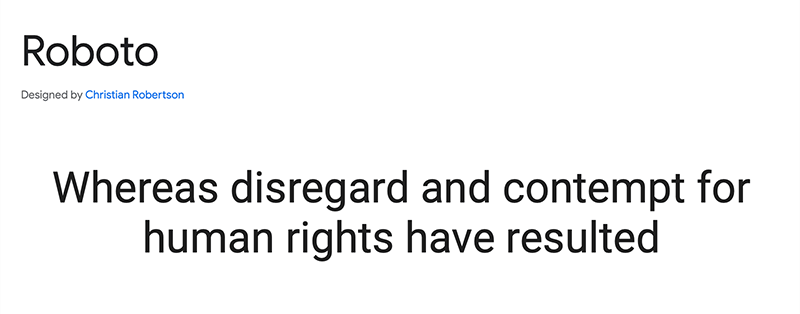
Roboto is a typeface with both mechanical and geometric elements, blending a structured skeleton with open, friendly curves. It doesn’t make compromises, compared with other fonts that alter letterforms to fit a strict rhythm.
Likewise, it keeps the natural width of its characters, making reading feel more fluid and natural. This unique combination of qualities gives Roboto a natural reading rhythm akin to humanist and serif fonts.
3. Lato
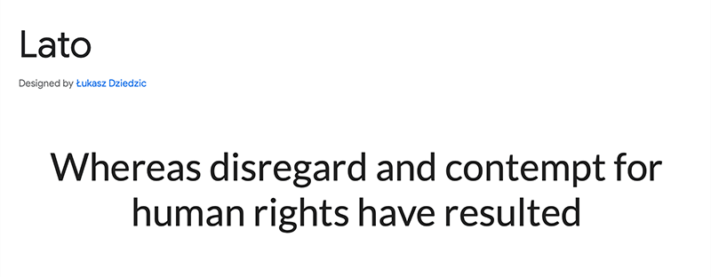
Lato is a sans-serif typeface family initiated by designer Łukasz Dziedzic in 2010, named after the Polish word for “Summer”.
It was subsequently released in December 2010 under the Open Font License. This release was made through Łukasz Dziedzic’s foundry in Poland and had support from Google.
This typeface family offers a versatile and open design suitable for various applications in typography and design.
4. Merriweather
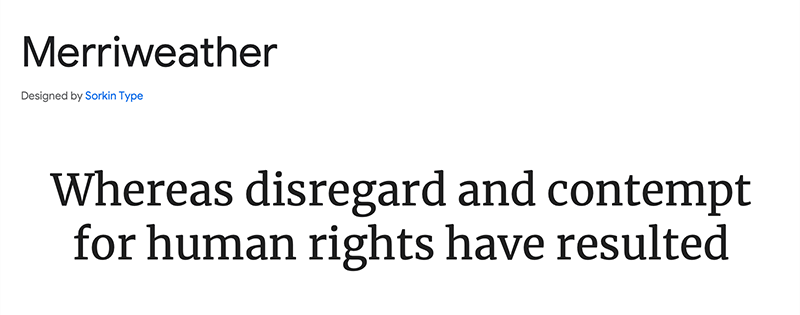
Merriweather is a text-focused typeface meticulously crafted for legibility on screens. It features attributes such as a generous x-height, slightly condensed letter shapes, subtle diagonal stress, sturdy serifs, and open forms.
Additionally, there is a sans-serif counterpart called Merriweather Sans. It’s designed to closely complement the weights and styles of the serif family.
Together, these typefaces provide a harmonious and versatile choice for both traditional and screen-based typography needs.
5. Playfair Display
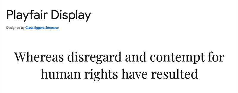
Playfair is a transitional typeface. It reflects the transition from quills to steel pens in the European Enlightenment of the late 18th century. This transition allowed for high-contrast letterforms with delicate hairlines, distinct from handwritten styles.
The Playfair font family accompanies the Playfair Display SC small caps family. It incorporates features such as full small caps, common ligatures, and discretionary ligatures to enhance typographic versatility.
6. Montserrat
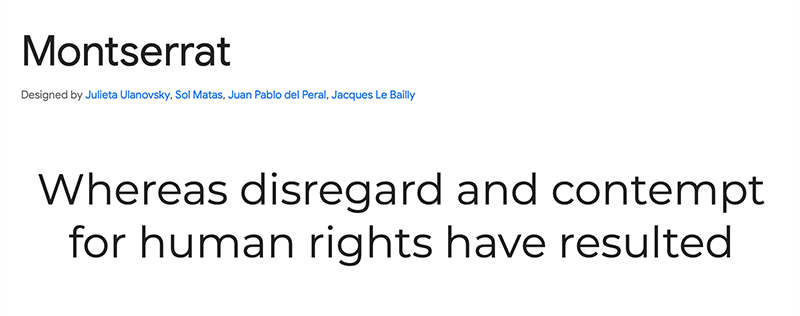
Julieta Ulanovsky drew inspiration from vintage posters and signage in Buenos Aires’ traditional Montserrat neighborhood. Her aim was to preserve the charm of early 20th-century urban typography through the creation of the Montserrat typeface.
As urban development alters the neighborhood’s landscape, these unique and special designs are disappearing forever.
The letters that inspired the project embody qualities such as dedication, color, contrast, and vitality. They contribute to the city’s aesthetic appeal, enhancing its visual allure day and night.
7. Poppins
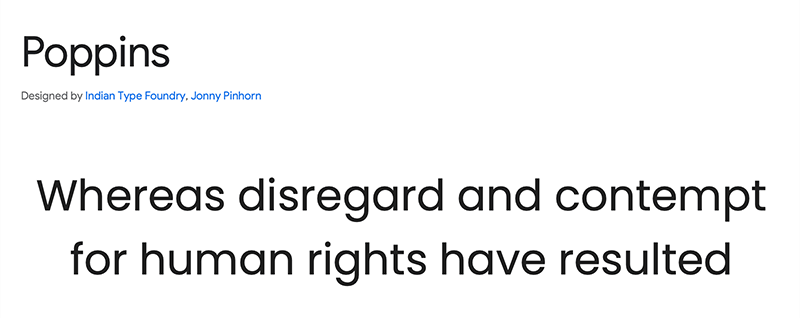
Poppins is a contemporary geometric sans-serif typeface. It’s designed to accommodate both the Devanagari and Latin writing systems, providing an internationalist perspective within this genre.
The Latin characters in Poppins exhibit a more constructed and rationalist style than what’s typically seen. The Devanagari design is groundbreaking, introducing a range of weights based on pure geometry, notably circles, a first in this genre.
The typeface maintains monolinear letterforms with optical adjustments for balance and harmonizes Latin and Devanagari character heights.
#Tips – Mistakes to Avoid
i. Avoid Unattractive Fonts
Selecting appealing fonts is crucial for your website, as they greatly influence the user experience and overall site perception. Unattractive fonts may deter visitors, reducing the site’s credibility and professionalism.
Using a whimsical or comic-style font like “Comic Sans” on a financial services website undermines its seriousness and trustworthiness. This can potentially drive away potential clients.
To convey a more appropriate image, it’s advisable to opt for a conventional and professional font such as “Helvetica” or “Arial”. These fonts are better suited for financial services websites.
Furthermore, unattractive fonts can hinder readability, making it challenging for users to consume your content. When your website’s text is challenging to read due to a font choice, visitors are inclined to leave. This results in reduced engagement with your content.
In summary, selecting attractive and suitable fonts enhances your website’s aesthetics and readability. This, in turn, upholds its credibility and professionalism. Always consider brand image and context when choosing fonts for a positive user experience.
ii. Don’t Use Chaotic and Hard-to-Read Fonts
It’s important to avoid difficult-to-read fonts when choosing fonts for your website. They can greatly harm the user experience and drive away visitors. Such fonts can frustrate users and make it difficult to read content, which will eventually turn users off.
Using an excessively bold font with intricate details on a news website can make headlines and articles nearly illegible. This impacts the readability and accessibility of the content. It can frustrate readers and hinder information consumption.
The font’s complexity may frustrate information-seeking visitors. They could choose to go to a news website with an easier font instead.
Alternatively, employing clean and legible fonts such as “Arial” or “Verdana” ensures that your content is easily understood. This enhances the user experience and encourages longer visits to your website. Moreover, it helps build trust in the reliability of your content.
In conclusion, a website’s efficiency depends on avoiding jumbled and difficult-to-read fonts to ensure user interest and readability. Give emphasis on fonts that improve the user experience and match the audience and aims of your content.
iii. No Inadequate Contrast
Avoiding inadequate contrast in font choices is essential because it directly impacts readability and accessibility on your website. Low contrast can make content difficult to read, especially for users with vision impairments, hindering their overall experience.
Insufficient contrast between text and its background poses challenges for readers, particularly those with vision impairments. These individuals may struggle to recognize the content, leading to a poor user experience. Addressing contrast issues is essential for website accessibility and inclusivity.
For example, employing light gray text on a white background or yellow text on a light background can strain users’ eyes, making it challenging to read the content. Hence, your website can lose visitors rapidly if they find one with higher contrast and readability.
In contrast, using proper contrast, like black on white or dark on light backgrounds, ensures legible content.
Improving contrast not only enhances the user experience but also extends your website’s accessibility to a broader audience. This includes individuals with visual impairments and those reading in low-light conditions. Consequently, it contributes significantly to your website’s overall effectiveness and inclusivity.
iv. Not Utilizing White Space
No doubt, white space plays a pivotal role in enhancing readability and overall design aesthetics. White space, often called negative space, creates breathing room around the text. It enables users to concentrate on content without feeling overwhelmed.
For example, cramped text without ample white space appears cluttered and hampers readability. Visitors may quickly lose interest and leave.
Meanwhile, the thoughtful use of white space, including proper line spacing and margin widths, enhances the content’s visual appeal. This also facilitates easier comprehension for readers.
Imagine a news website where articles are presented with lots of white space surrounding the photographs and in between paragraphs. The text is easy for readers to navigate, allowing them to easily assimilate the information.
Conversely, a cluttered design with little white space can overwhelm readers, which will have a negative effect on their experience.
Ultimately, using white space enhances your font and design choices, making website content inviting, readable, and visually appealing. It dramatically boosts user engagement and creates a favorable first impression.
v. Avoid Random Font Size Selection
When selecting fonts for your website, it’s important to avoid using random font sizes. It directly impacts readability and the user’s ability to engage effectively with your content. Uneven font sizes hinder users’ ability to navigate websites without interruptions.
Consider a blog post where the font widths for the headings and paragraphs differ at random. The lack of distinction between main points and supporting text leads to reader confusion. Due to the lack of visual structure and coherence, users could rapidly lose interest.
Conversely, a deliberate font size hierarchy, including headings, subheadings, and body text, ensures seamless content navigation. This consistency allows users to easily understand the organization and importance of information. Consequently, it leads to a more engaging and satisfying reading experience.
Finally, it’s crucial to avoid choosing font sizes at random and to create a clear hierarchy. They greatly enhance user engagement, readability, and overall website design and content effectiveness.
vi. Don’t Use Multiple Font Colors Unnecessary
Avoid using unnecessary multiple font colors because it can lead to visual chaos, reduced readability, and an unprofessional appearance. Inconsistent and purposeless use of font colors can distract users from the content’s message. It can also make it challenging for them to follow the information presented.
Imagine a news website where each article uses a different font color randomly. This can confuse readers, making it hard to find headlines, important details, or links. Users might get upset and leave the website to find news that’s easier to read and understand.
Using the same colors purposefully for headings, links, and important parts makes the website look better. It also helps readers understand it more easily.
For example, making links blue and important things red helps users know what to click on and improves their experience.
Avoiding unnecessary and inconsistent font color choices contributes to a more organized and professional appearance for your website. Ultimately, this improves user engagement and satisfaction.
#Case Study – Examples of Websites with Effective Font Choices
Check out these 7 typography examples to get an idea of what good font design looks like. We’ll analyze what makes these fonts effective online and how they enhance the website’s branding.
1. Wendy Ju
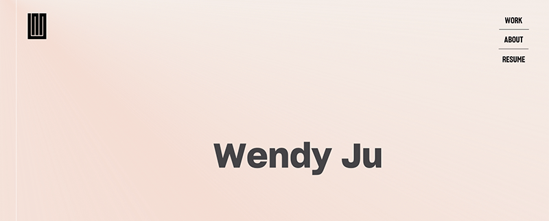
By pairing readable fonts like Avenir Next with animations, Wendy Ju achieves an impressive typography design.
Her website features highlighted words with vibrant colors and hover effects, adding an interactive dimension to the user experience and making it stand out. This combination of typography and interactivity enhances her site’s impact.
2. Nurture Digital

Nurture Digital demonstrates a strong grasp of typography, evident in its prominent and animated bold letters on the left side.
These letters are customized for each portfolio piece, offering unique designs, animations, and color schemes for each case study on the homepage. The fonts used in the design work well with the other design elements, making the user experience balanced and engaging.
3. Blink My Brain
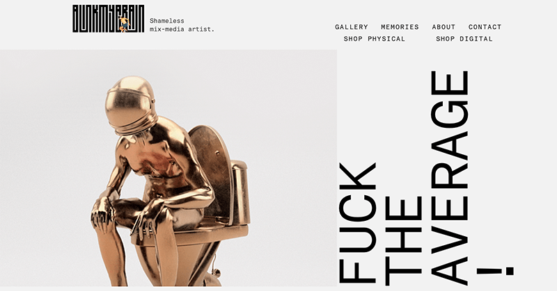
Blink My Brain‘s website is a visual masterpiece with captivating typography. The combination of futuristic metallic fonts and handwritten styles creates a welcoming atmosphere. The landing page offers a glimpse of the designer’s trendy font skills, leaving a lasting impression on visitors.
4. OpenWeb
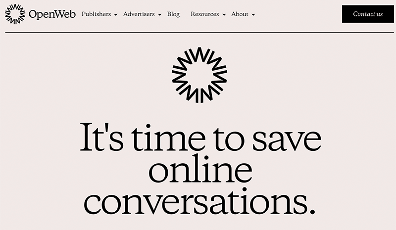
OpenWeb, dedicated to enhancing online communications, boasts a website with excellent typography and readability. Its noticeable headlines, a rarity in online publications, align with its mission. The site’s light color scheme and ample white space mirror the company’s values of open, honest, and respectful communication.
5. The New Yorker
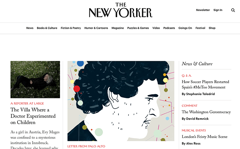
The New Yorker retains its iconic font from the print magazine on its website and ensures brand consistency across platforms.
The choice of a serif font imparts a traditional and well-established aura to the publication, resonating with its history and reputation. This typographic choice contributes to maintaining the magazine’s identity in the digital realm.
6. Italic Type
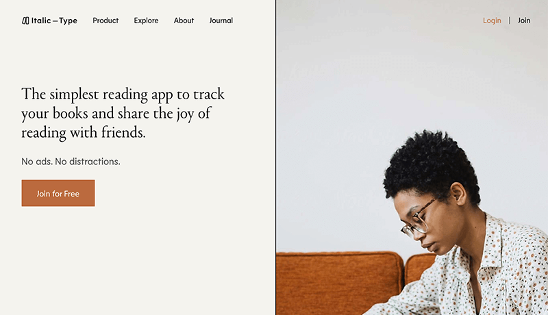
Italic Type‘s homepage stands out, particularly the white sections with black text beneath the hero section. The subtle use of light gray highlights beneath specific words is a nice touch, guiding the visitor’s focus. Furthermore, the design’s playful exploration of typography includes outline text and hand-drawn style underlines in other sections.
7. Pink Chili
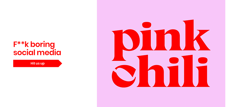
Pink Chili, a marketing agency targeting Gen Z, infuses its website with trendy design elements. Given the text-heavy nature of the site, typography plays a crucial role.
Their brand name takes center stage, showcased in a bold cherry-red serif font above the fold. This attention to font size, kerning, and color enhances the user experience while preserving their branding.
#FAQs – How to Choose the Best Font for Your Website
1. How do I choose the right font for a website?
Select the right website font by emphasizing readability, aligning with brand identity, and maintaining visual harmony for a balanced style and legibility.
2. What fonts do professional websites use?
Professional websites often use a combination of serif and sans-serif fonts that convey a clean and modern aesthetic while maintaining readability. Some commonly used fonts on professional websites include Roboto, Lato, Open Sans, Merriweather, Helvetica, etc.
3. How do fonts improve readability?
Fonts enhance readability by influencing text perception through style and legibility. Legible font styles, proper sizing, and spacing reduce strain and improve clarity. Additionally, aligning fonts with content and context enhances comprehension and engagement.
4. Which font should you avoid on your website?
Some fonts are not suitable for websites, and one of the most famous examples is Comic Sans. It’s a fun font often seen in kids’ books and cartoons, but it’s not seen as professional for most websites.
Learn the in-depth guide of how to create a website from scratch for begineers.
Conclusion
In this article, we looked at how to choose the best font for a website. We hope this article provides an idea of how to choose the right font for your website.
In conclusion, selecting the right font for your website is a critical decision in web design. We hope this ultimate guide has provided you with the essential principles to make an informed choice.
Remember, your website’s typography plays a vital role in engaging and retaining visitors. These tips will elevate your website’s appeal and user experience, leaving a lasting impact on your audience.
Please feel free to comment below if you’ve got any further queries about how to choose the best font for a website. We’ll do our best to respond as soon as we can.
Also, let us know which font you are using for your website. You can share your top pick in the comments section below.
Besides that, we’d also love to hear your thoughts on this article. So, please feel free to comment on any queries or suggestions below.
You may also want to check out our articles on the best AI WordPress themes and learn about common WordPress mistakes to avoid. Also, learn how to change footer text and background color.
Follow us on Facebook and Twitter for more articles like these. Also, if you liked this article, then share it with your friends and colleagues.
YOU MIGHT ALSO LIKE...
We've picked you some best articles that you might be looking for. Check them now!