Are you looking for the best accessible website examples? If the answer is yes, then you’ve landed on the perfect page.
Accessible websites comply with accessibility standards and embody various principles to ensure every individual can navigate and engage seamlessly. Such websites play a vital role in providing an inclusive web experience for users of all abilities.
This article lists multiple accessible website examples. All of them not only meet technical requirements but also inspire you with their innovative design and functionality.
So, join us in uncovering the elements that make these websites stand out. Get set, go!
What is an Accessible Website? Why Make Your Website Accessible?
Before we dive into the list, let’s learn about accessible websites and their significance.
An accessible website is designed and developed to ensure that people with disabilities can perceive, comprehend, navigate, and engage with the content. Further, website accessibility refers to the use of tools and techniques to implement such sites for disabled communities.
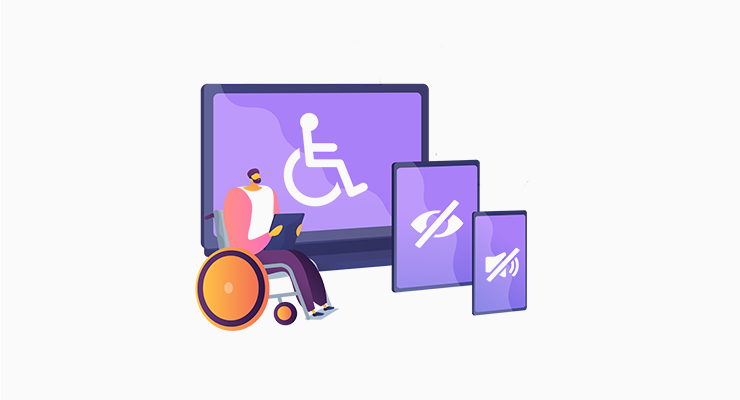
The disabilities that may impact web accessibility are visual, auditory, motor, and cognitive impairments. All users, regardless of ability, should enjoy a barrier-free web experience. That’s the ultimate motive of accessible websites.
Wondering why making an accessible website is crucial? Then, find the reasons below:
- Inclusivity: An accessible site ensures each person, regardless of their abilities, can access and use the website content. This equalizes the participation opportunities.
- Legal Compliance: Many countries mandate websites to be accessible according to their legal requirements and standards, like the Web Content Accessibility Guidelines (WCAG). Failing to comply with these standards may lead to legal consequences.
- Larger Audience Reach: Having an accessible website helps you reach a larger audience group, including people with disabilities.
- Enhanced User Experience: Using the accessibility features, your site can improve the overall user experience. For instance, consistent navigation benefits all users.
- Search Engine Optimization (SEO): Some accessibility practices align with good SEO practices. Ultimately, this improves your website’s ranking on search engines.
With that, let’s jump into the next section!
Components of an Accessible Website
Prioritizing accessibility in web design is crucial for creating a holistic online experience. This checklist below encompasses key components of an accessible website. Including them on the site will provide a user-friendly interface for individuals with varying abilities.
So, look at these components and make your website welcoming and universally accessible:
| Components | Description |
| Color Contrast | Your website should allow users with visual impairments to contrast between text and background colors to make the content readable. |
| Keyboard Navigation | Ensure your site’s interactive elements and their functionalities are accessible using a keyboard alone. This is vital for users who can’t use a mouse. |
| Alt Text | It’s essential to insert Alt text for all images, graphics, and other non-textual content. Ultimately, this helps people with visual impairments understand the content when the visual element can’t be displayed. |
| Descriptive Links | You should keep descriptive and meaningful text for hyperlinks. Simply put, you mustn’t use generic terms like ‘click here’ and rather give context about the link destination. |
| Readable Text | The website content must have legible text and be resizable without losing its content or functionality. Some vital elements include font size, line spacing, font style, etc. |
| Semantic HTML | Semantic HTML markup lets you structure your web content in a meaningful way. Hence, you must properly use headings, lists, and other HTML elements to relay the document structure to both people and assistive technologies. |
| Compliance with Accessibility Standards | Your website must follow accessibility standards like WCAG. As a result, these standards offer guidelines to make the website content more accessible for everyone. |
| Consistent Navigation | The navigation and layout of your website must be consistent. If your website is consistent, then users can understand the structure and find their way around more easily. |
| Minimal Effects and Animations | Animations and effects can be hard to comprehend for some people due to their rapid movements. Even if you use them on your site, ensure they include options to pause, stop, or adjust the speed. |
| ARIA (Accessible Rich Internet Applications) | ARIA introduces multiple attributes that developers can integrate into HTML elements. This facilitates better navigation and helps in understanding dynamic content. |
Find the best practices for website navigation in this complete guide.
How to Test for Website Accessibility?
Did you know? You can test the websites to see if they are accessible using online tools. They not only help you identify the accessible sites but also find the current state of your website.
Thankfully, some commercial and free tools can audit and instantly scan your website. Further, these tools highlight accessibility problems and suggest solutions.
Among the various website accessibility tools, we used 2 free ones to identify accessible websites. So, you can also use them to find more or check your website. The tools are:
1. accessScan
accessScan is an automated tool that tests whether your site is ADA-compliant (Americans with Disabilities Act). Just submit your website’s URL and click ‘Get Audit’. This quickly automates page auditing to check its compliance with accessibility standards.
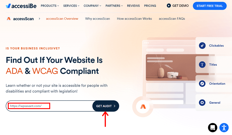
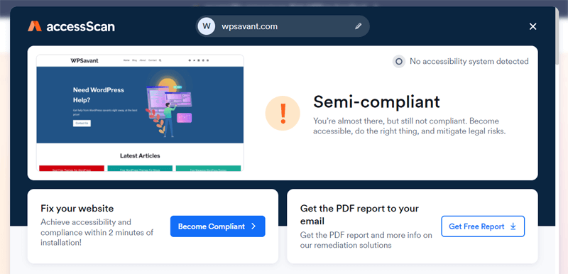
Ultimately, you’ll get a score, either compliant, semi-compliant, or non-compliant. Further, it also provides a detailed report highlighting the website elements that require attention.
2. Wave
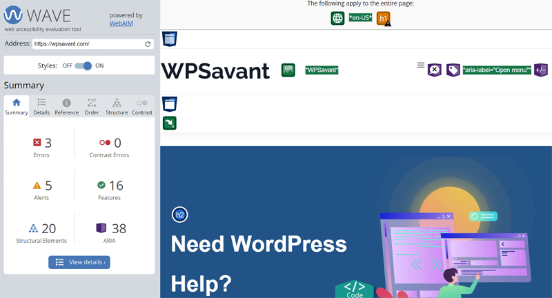
Wave is a web accessibility evaluation tool to make your web content more accessible based on standards and human evaluation. All you need to do is enter your web address and hit enter. In a short while, this tool runs the audit to provide a detailed report.

As a result, you can find a summary of errors, alerts, features, ARIA counts, and the number of structural elements on your page. In addition, it also gives details related to each of them separately. Not to mention, you can preview your web page mentioning all those factors.
Now, we know about accessibility websites and ways to identify them. With that, let’s dive into the list of the best accessible website design examples!
27 Accessible Website Examples for Web Design Inspiration
Here are accessible website examples of various website niches to inspire your new site design. It’s difficult to mention all of the inspirational websites. So, we tried to mention those that are popular and performed well on the accessibility tests.
With that being said, let’s move on!
1. Honda
Honda is an excellent example of an accessible website. This is the official website of the popular car, motorbike, marine, and power product manufacturing company in the UK. Its website is all about its corporate activities and products.
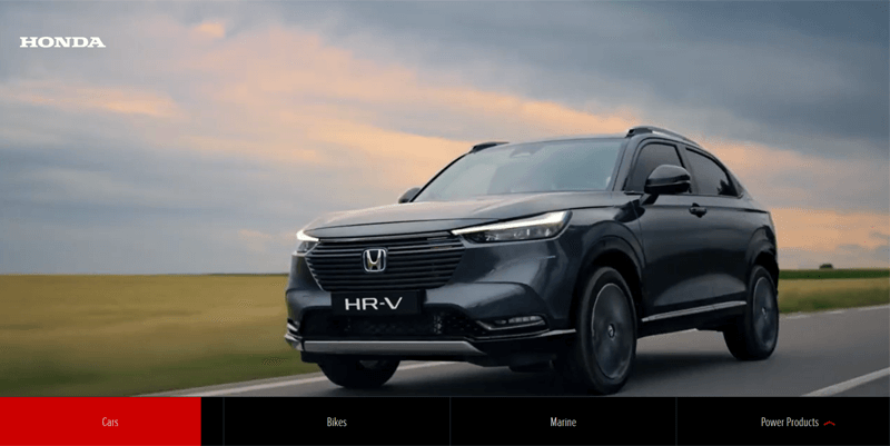
As a global vehicle manufacturer, it provides valuable content to engage and maintain its strong community. For that, it applies an accessible approach, such as labeling different elements, uncomplicated structure, minimal contrast errors, etc.
- Niche: Business website
- Target Audience: Potential customers, current owners, and the general public.
- Twitter: @Honda_UK
- Facebook: Honda UK
2. Ultima Replenisher
One of the best accessible website examples for inspiration is Ultima Replenisher. It’s an online store that sells electrolyte mixes of various flavors, like lemonade, grape, orange, blue raspberry, etc. All of which includes 6 key electrolytes, 0 sugar/carbs/calories, etc.
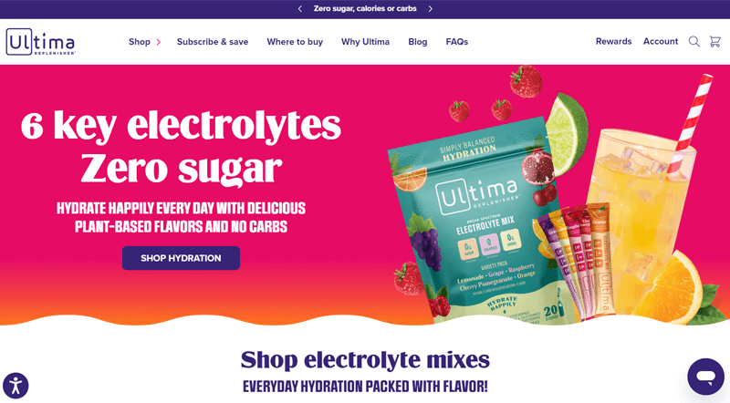
On this website, you can clearly find an accessibility controller at the bottom left. Upon clicking that, users can select their accessibility profile, such as keyboard navigation, vision impairment, etc. Further, people get to adjust the content, color, and orientation as they like.
- Niche: eCommerce website
- Target Audience: Individuals engaged in physical activities, athletes, sports enthusiasts, and the general public looking for natural and sugar-free drink mixes.
- Instagram: goultima
- Facebook: Ultima Replenisher
3. NPR
NPR (short for National Public Radio) contains several accessibility features for global audiences. This website is all about news, analysis, music, arts, and podcasts. The main aim of its content is to inform, engage, and educate every individual with journalism.
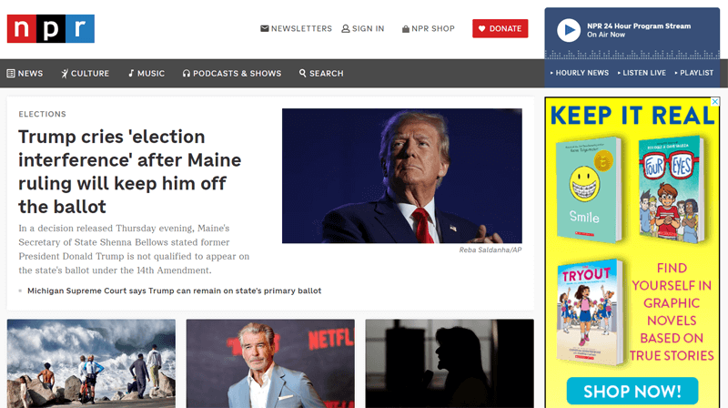
In addition, this website contains accessibility features like transcripts, ARIA labels, keyboard navigation, screen reader compatibility, video captioning, color contrast ratio, etc. Further, the design of the website itself is clean, well-structured, and easy to navigate.
- Niche: News website
- Target Audience: The general public interested in news, culture, art, etc.
- Twitter: npr
- Facebook: NPR
4. Nature
Nature is the journal website of the Springer Nature Limited company. It publishes their most significant discoveries and findings to advance knowledge and address the challenges of the world. Further, the website focuses on reviews, critical comments, news, and analysis.
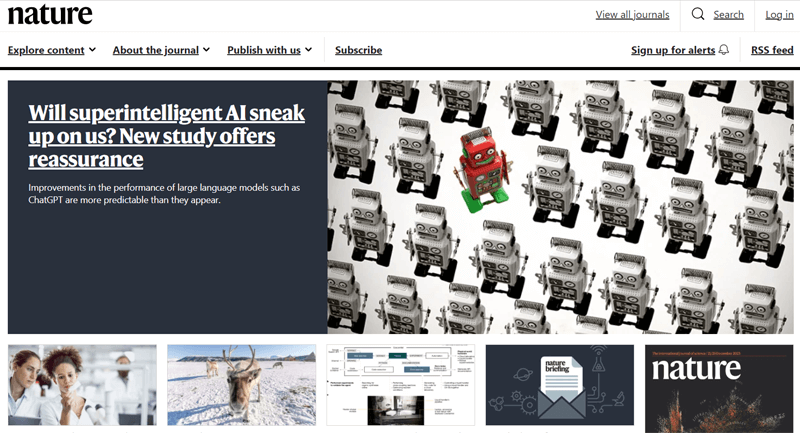
Moreover, Nature supports screen readers, screen magnifiers, and speech recognition software for accessibility. In addition, it has features like adjustable font size, color contrast ratios, keyboard navigation, etc. Also, it’s compliant with WCAG and other standards.
- Niche: Scientific journal website
- Target Audience: Researchers, scientists, academics, and interested individuals.
- Subscription: Nature
5. Altuzarra
Altuzarra is an online shopping platform for women. It sells handbags, accessories, and women’s clothing with various offers and discounts. This website has several images, but each of them contains their details in an organized manner.
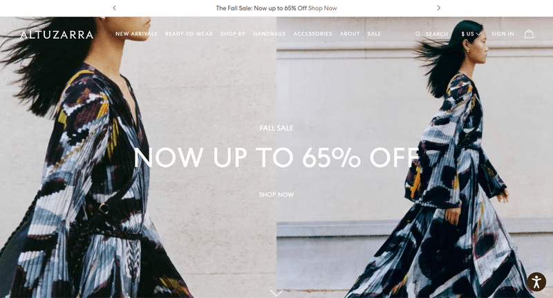
In addition, this website uses the accessiBe software for web accessibility. Ultimately, you can find the accessibility adjustment controller at the bottom right side of the website. There, people can choose their language, and accessibility profile, and further adjust the site.
- Niche: eCommerce website
- Target Audience: Female buyers
- Twitter: @AltuzarraStudio
- Facebook: Altuzarra
6. Twice
Twice is the accessible website of an award-winning oral wellness company. This website sells healthy toothpaste, whitening pens, floss, immunity rinses, etc. Overall, the site design is pretty clean, attractive, and easy to understand at the same time.
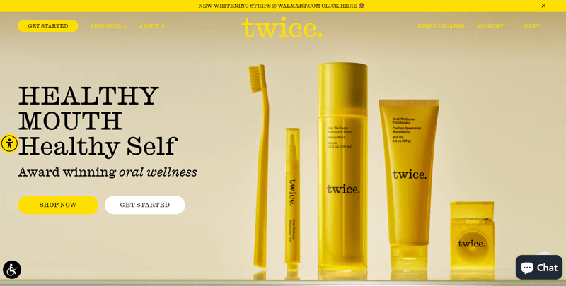
Moreover, this site has the same accessibility adjustment controller as Ultima Replenisher and Altuzarra. In addition, there’s an accessibility menu by UserWay with options like a screen reader, highlight links, pause the animation, hide images, dyslexia-friendly, etc.
- Niche: eCommerce website
- Target Audience: People concerned about a healthy mouth.
- Twitter: @twicetoothpaste
- Facebook: Twice
7. CapitalOne
CapitalOne is a financial institution offering banking and financial services, including credit cards, loans, etc. The CapitalOne website serves as an online portal for customers to access and manage their financial products and services.
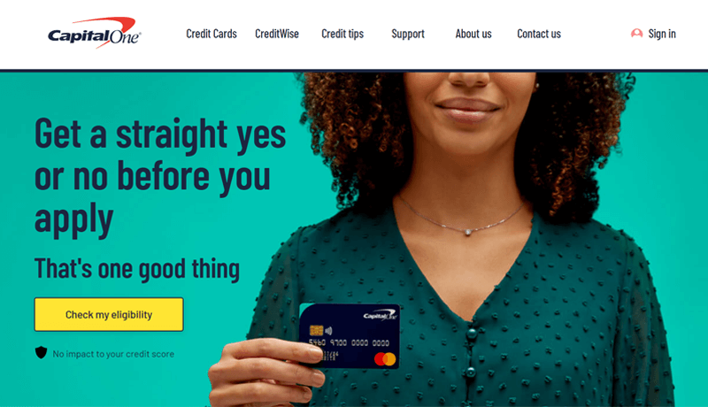
Moreover, this site focuses on providing accessibility features for people with sight and hearing issues. You can zoom in and out of a browser window and your whole screen. Further, it lets you change all font sizes, color contrast, and download screen readers.
- Niche: Financial service business website
- Target Audience: Individual customers and businesses using their services.
- Twitter: @CapitalOneUK
- Facebook: Capital One UK
8. Reuzel
Another online shopping website with accessibility features is Reuzel. This website sells hair styling, beard, and pomade products for men. It uses black, white, and red shades and eligible text, increasing its potential to captivate users.
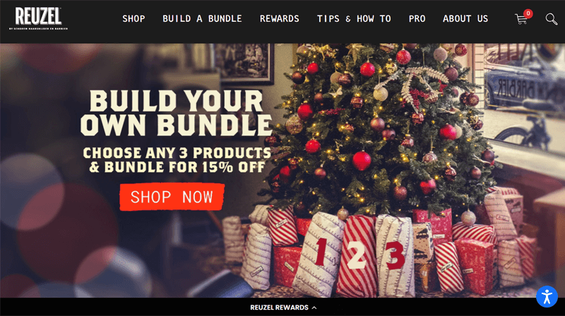
On top of that, you can adjust the color, orientation, and content with a few clicks. Other than the default features, it also supports multiple browsers and assistive technologies. For example, it supports NVDA screen readers for both Windows and Mac users.
- Niche: eCommerce website
- Target Audience: Male buyers
- Twitter: @reuzel
- Facebook: Reuzel Pomade
9. BBC
BBC (short for British Broadcasting Corporation) is one of the most popular media organizations worldwide. Its website acts as a central hub for news, entertainment, travel, weather, TV, earth, and many other multimedia contents.
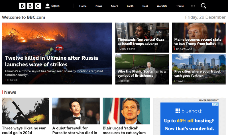
Regarding accessibility, this website provides various resources and documents to help users of all abilities access the content. Moreover, the web design is well-structured and uses several ARIA labels without any contrast errors.
- Niche: News and media website
- Target Audience: The general public interested in news, sports, entertainment, etc.
- Twitter: @BBC
- Facebook: BBC
10. 1% for the Planet
Another one of the most popular accessible website examples on this list is 1% for the Planet. It’s an official website for the global network of businesses and environmental organizations supporting people and the planet. Thus, it aims to donate 1% of the annual sales.
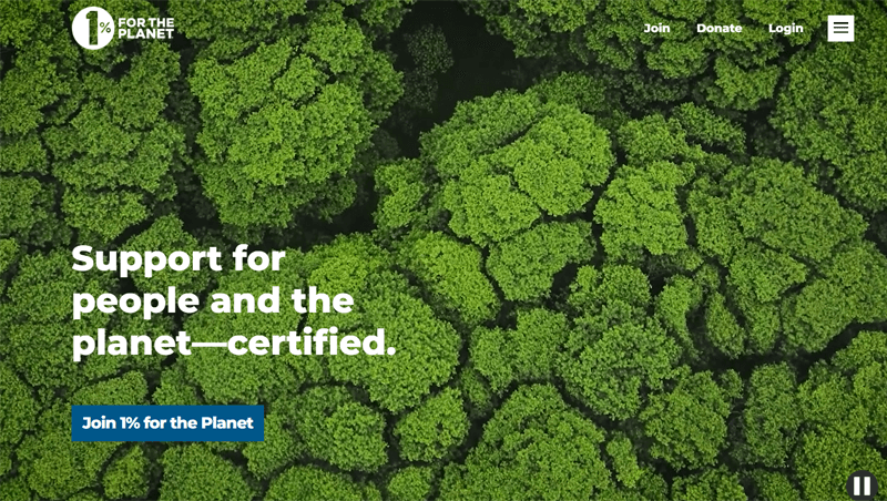
Further, the website test reports show the usage of several structural elements, ARIA labels, etc. Although there are some errors, they are open to resolving accessibility needs. So, it’s compliant with the WCAG standards and part of Accessible Web’s A11Y Partner Program.
- Niche: Non-profit website
- Target Audience: Businesses, consumers, other non-profit organizations, etc.
- Instagram: 1percentftp
- LinkedIn: 1% for the Planet
11. Harvard University
Harvard University is the official website of the renowned educational institute. Its website contains information and resources related to the university, including academic programs, admissions, events, alumni relations, etc.

In addition, this website complies with digital accessibility standards. Also, it uses several structural elements and ARIA labels for users to easily navigate and understand the content. In addition, you can find readable content throughout the website.
- Niche: Educational website
- Target Audience: Students, parents, faculties, alumni, etc.
- Instagram: harvard
- Facebook: Harvard University
12. Futuro Health
If you want to launch an accessible health-related website, then look at Futuro Health. This website was made by an organization focusing on addressing the shortage of healthcare workers in California. Moreover, it offers various programs and courses in the same niche.
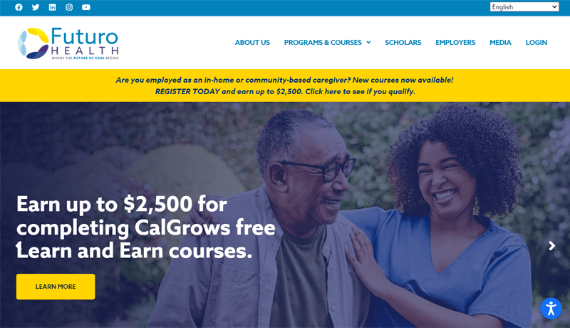
On this website, you can find various accessibility profile choices and adjustment options. Along with that, the website design is itself phenomenal, with constant navigation, readable content, descriptive links and image captions.
- Niche: Health and educational website
- Target Audience: Aspiring and current health workers, educational institutes, etc.
- Twitter: @futuro_health
- Facebook: Futuro Health
13. Hygge & West
Do you want inspiration for your creative and design-related site? Then, check out Hygge & West. This eCommerce website is owned by a design company specializing in wallpaper, textiles, and home decor. It showcases the products in a clean yet stylish way.
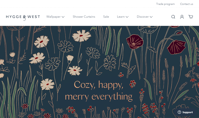
Other than its soothing web design, the footer contains the web accessibility function. Using it, users can read their statements, hide the interface, and search terms in the dictionary. Further, they can customize the website as they want for better understanding.
- Niche: eCommerce website
- Target Audience: Homeowners, interior designers, decorators, home renovators, etc.
- Twitter: @hyggeandwest
- Facebook: Hygge & West
14. SnackNation
Yet another attractive and highly accessible website is SnackNation. Gladly, it’s a company website providing curated snack boxes for workplaces. All of its snacks are healthy, and people can select from a wide range of snacks.
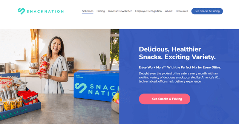
Overall, this website includes accessibility adjustment features like many of the other sites on this list. In addition, it supports the use of screen readers by individuals with visual impairments to view the website content.
- Niche: Business and eCommerce website
- Target Audience: Businesses, employers, event planners for corporate functions, etc.
- Twitter: @GiveCaroo
- Facebook: Caroo
15. Patreon
Patreon is an emerging membership website that lets creators earn revenue by offering exclusive content and experiences to their fans (patrons). Generally, one can configure many membership tiers for fans to select one based on their budget and interests.
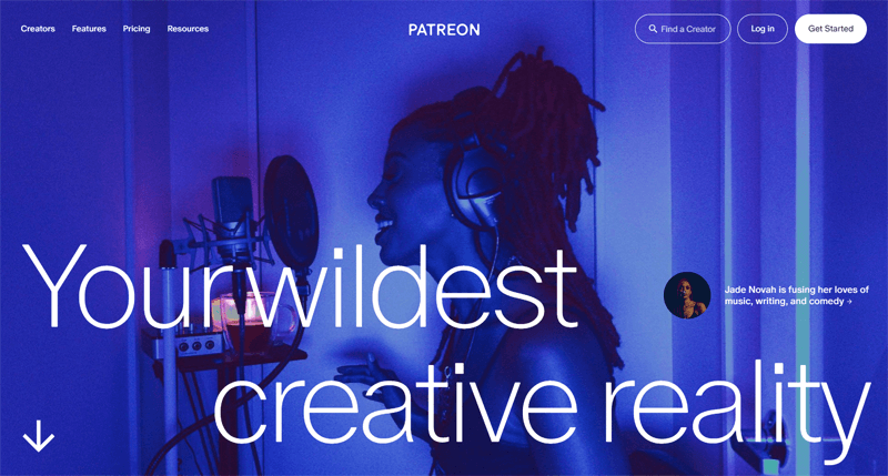
In terms of web accessibility, this website contains a skip navigation link at the top of each page to directly focus on the body content. Further, people can use ‘tab’ and ‘shift+tab’ to move forward and backward for keyboard navigation.
- Niche: Membership website
- Target Audience: Artists, writers, musicians, podcasters, and other content creators. Also, the general public showing interest in their content.
- Twitter: @Patreon
- Facebook: Patreon
16. ACLU
Another website that cares about web accessibility is ACLU (short for American Civil Liberties Union). This website provides information about the non-profit organization, its mission, and its ongoing work for preserving civil liberties and rights protection.
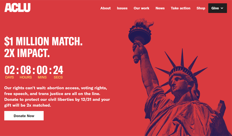
Moreover, this website commits to becoming accessible to all. So, you’ll find some features like consistent navigation, ARIA labels, etc. But if people find accessing the content hard or have suggestions, then they can email with the ‘Website Accessibility’ subject line.
- Niche: Non-profit website
- Target Audience: Advocates, community activists, legal professionals, etc.
- Twitter: @ACLU
- Facebook: ACLU
17. Partake Foods
Partake Foods specializes in producing allergy-friendly and delicious snacks. Their website focuses on its products, stories, and ingredients. All of which is organized and presented with clarity for better website accessibility.
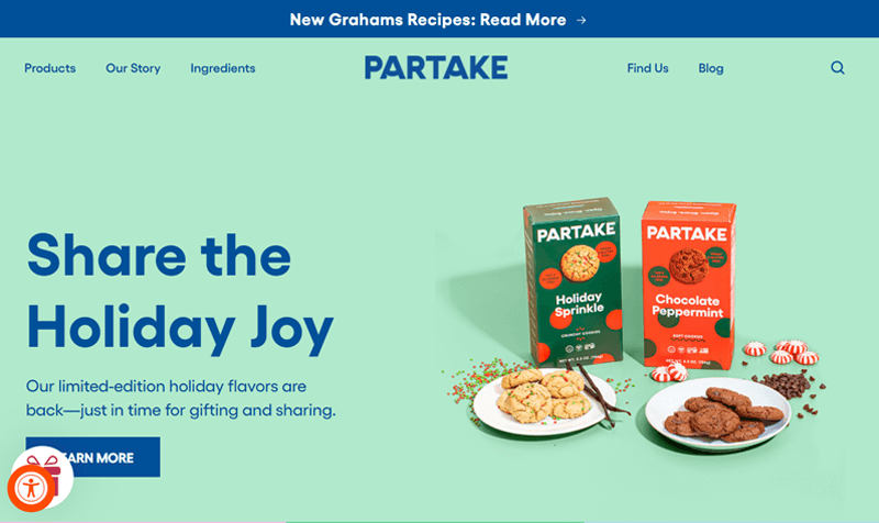
Delightfully, the bottom left side of the website has an option to preview its accessibility features for content, color, and navigation. Some notable elements include bigger text, stop animations, page structure, invert the colors, dyslexic font, etc.
- Niche: Food business website
- Target Audience: People with food allergies, dietary restrictions, and sensitivities.
- Twitter: @PartakeFoods
- Facebook: Partake Foods
18. American Foundation for the Blind
If your organization focuses on disabled individuals, then it’s extra crucial to have an accessible site like the American Foundation for the Blind. This site belongs to a non-profit organization focused on enhancing the quality of life for people with visual impairments.
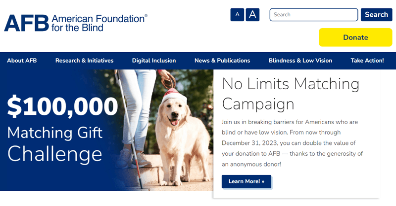
Sticking with their mission, the website complies with WCAG and standards for authoring tools. Further, it supports the use of screen readers and screen magnifiers. The site design also has eligible text, buttons, icons, and others, with the ability to increase the font size.
- Niche: Non-profit website
- Target Audience: Individuals with visual impairments, their family members, caregivers, community organizations, etc.
- Twitter: @AFB1921
- Facebook: American Foundation for the Blind (AFB)
19. Modloft
Modloft is a company website specializing in modern furniture design and manufacturing. This website sells furniture pieces for different living spaces. So, you can choose among the given categories and purchase their items online.
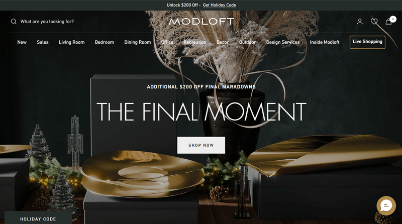
Upon clicking on the Accessibility menu on its footer, an accessibility assistant pops up. There, you can search for unfamiliar terms in the dictionary. Also, choose a profile among vision, cognitive, ADHD, etc. Further, it lets you adjust the color, content, and navigation.
- Niche: Business and eCommerce website
- Target Audience: Homeowners, interior designers, architects, and more.
- Twitter: @modloft
- Facebook: Modloft
20. National Institutes of Health
National Institutes of Health is a website for the organization that conducts and supports medical research. This site provides details about the organization, its mission, and its research.
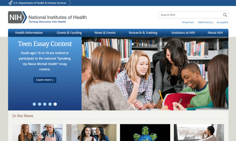
Its web design is simple, yet it conveys all the information in a detailed manner. In addition, the color contrast and structure of this website are already accessible. However, people can still contact them if they encounter issues regarding the accessibility of content.
- Niche: Health website
- Target Audience: Researchers, health professionals, trainees, patients, etc.
- Twitter: @NIH
- Facebook: National Institutes of Health (NIH)
21. Christie’s
Christie’s is a famous auction company that sells fine art, antiques, jewelry, and other valuable items. Moreover, you can find all the upcoming auctions, information about the auctioned items, locations, stories, etc., on this website.
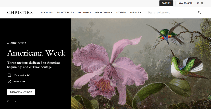
This website is accessible because it uses semantic HTML for structuring the content. Further, it also has consistent navigation with crucial components like a search bar and language picker. All of this helps people find the information they want with ease.
- Niche: Auction / business website
- Target Audience: Collectors, buyers, and sellers.
- Twitter: @ChristiesInc
- Facebook: Christie’s
22. DAN
DAN (Divers Alert Network) is a non-profit organization providing emergency medical advice and assistance for underwater diving injuries. The DAN website contains information, resources, and services related to diving safety and medical support.
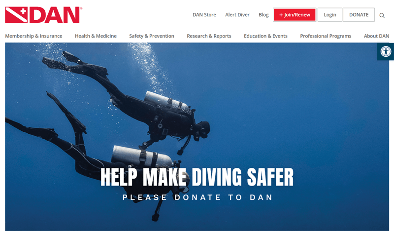
Moreover, it’s an ideal accessible website example because it offers multiple accessibility tools, like increase/decrease text, grayscale, high contrast, readable font, etc. Further, its web design also uses several ARIA attributes to define the role of every website component.
- Niche: Sports website
- Target Audience: Divers, dive instructors, health care providers, travelers, etc.
- Twitter: @DANGlobalSafety
- Facebook: Divers Alert Network
23. Tossware
Tossware is one of the most accessible website examples due to its readable text and consistent sticky navigation. This eCommerce site sells stylish and durable drinkware suitable for both casual and lavish settings.
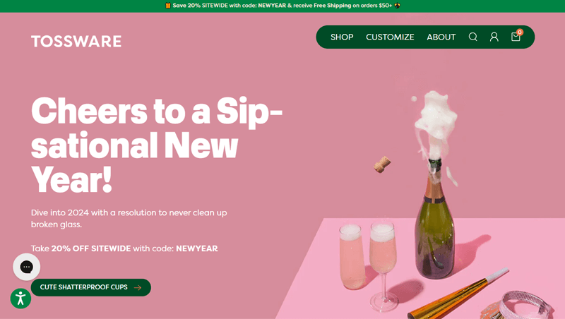
Moreover, you can find multiple accessibility adjustment options on the site. Simply put, there are many accessibility profiles like vision impaired, seizure-safe, cognitive disability, etc. Also, you can configure settings like stop animations, mute sounds, hide images, etc.
- Niche: eCommerce website
- Target Audience: Event planners, caterers, consumers, gift shoppers, etc.
- Instagram: tossware
- Facebook: Tossware
24. The Clear Cut
Are you looking for inspiration for starting an accessible jewelry website? Then, here’s The Clear Cut. This website is all about selling jewelry, especially diamond engagement rings. Also, you can learn how to make them from its tutorials.
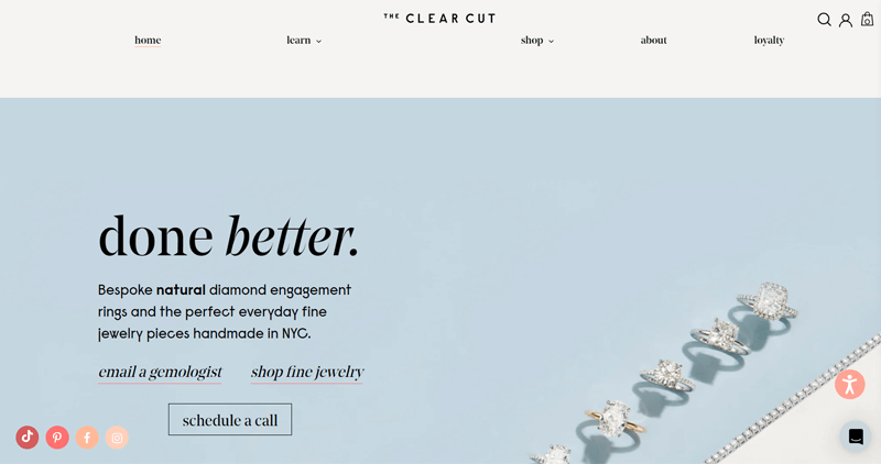
Like most accessible websites, it uses accessibility software to provide adjustment options. That includes adjustments for color, orientation, and content. Best of all, the web design also has minimal contrast errors and maximum utilization of ARIA attributes.
- Niche: eCommerce website
- Target Audience: The general public who wants to buy jewelry.
- Instagram: theclearcut
- Facebook: The Clear Cut
25. Cappello’s
Another eCommerce website selling food items is the minimal website, Cappello’s. It offers gluten-free pasta, biscuits, pizza, and cookie dough. This website contains information about their products, ingredients, stories, and recipes.
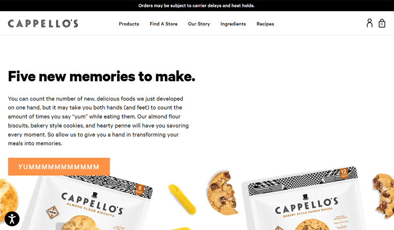
Overall, Cappello’s website uses eligible fonts without any animations or effects. Further, it contains accessibility adjustment features powered by accessBi. As a result, you can configure the website design and select a comfortable language to read the content.
- Niche: eCommerce website
- Target Audience: Health-conscious consumers and those with gluten intolerance.
- Instagram: cappellos
- Facebook: Cappello’s
26. Eventbrite
Eventbrite is an online platform for event planning, promotion, and ticket sales. You can create, customize, and promote your events. Also, it lets you manage ticket sales and registrations. Best of all, you can check out the upcoming events in your country.
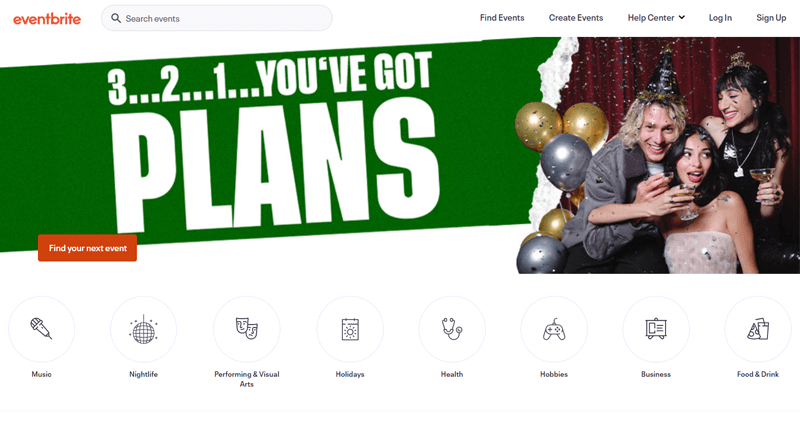
Delightfully, this website follows accessibility standards. Hence, the web design places emphasis on color contrast, logical heading order, and configurable repeated elements. As a result, you can use multiple input and output devices to access its website content.
- Niche: Event website
- Target Audience: Event organizers, artists, event attendees, businesses, etc.
- Twitter: @eventbrite
- Facebook: Eventbrite
27. Rip Van
Rip Van is another one of the ideal user-friendly and accessible website examples. This site sells innovative snacks, including waffles, wafers, cookies, and bars.
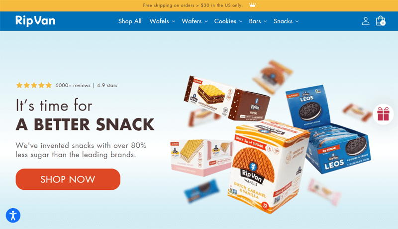
On its site, you can find multiple accessibility adjustment options for people with different disabilities. The web design itself uses several structural elements and ARIA attributes. To address its existing errors or add new accessibility features, you can send them an email.
- Niche: eCommerce website
- Target Audience: Foodies, online shoppers, snack enthusiasts, etc.
- Instagram: ripvansnacks
If you’re unaware of the website-building process, then here’s a tutorial on how to create a website from scratch.
Conclusion
And there you have it—the exploration of 27 accessible website examples. All of them serve as inspiration for your new website design. Each website highlights stellar designs and emphasizes the importance of accessibility.
Hopefully, this article has provided you with valuable insights and sparked creative ideas for your upcoming website projects. If you have additional examples that you believe deserve a spot on our list, then share them in the comments section below.
In case you need further clarification about accessible websites, then feel free to reach out to us. We are committed to assisting you in any way we can and as soon as possible.
Gladly, share this article with your network to share knowledge. You can use one of the best WordPress ADA compliance plugins to kickstart your website. Plus, read how to make a mobile-friendly website.
Lastly, stay connected with us on social media platforms like Facebook and Twitter for continuous updates.
