How to make a website mobile friendly? Is this question troubling you? If yes, then you’re in the right place to get the answer.
A mobile-friendly website is vital for reaching a wider audience and providing a seamless user experience. So, ensuring your site is mobile-optimized has become a necessity today.
Hence, we’ll walk you through the essential steps on how to make a mobile friendly website. These steps will not only meet your visitors’ expectations but also align with the latest standards.
So, get ready to transform your website into a mobile-friendly masterpiece. This journey will make your website not just accessible but enjoyable on each screen size. Get set, go!
What is a Mobile Friendly Website?
Before diving into the topic, let’s learn about mobile-friendly sites and their importance.
A mobile-friendly website is a website optimized for a good browsing experience for users on smartphones and tablets. Generally, these websites have a simplified design for smaller screens, making them easier to use on mobile devices.

However, there are many ways on how to make a website mobile friendly more. They are:
- One way is to let the website adjust itself to fit on any screen, which is called responsive design.
- Another way is dynamic serving, where the website shows a version made for different types of mobile devices.
- On the other hand, some websites also have separate apps for phones, but everyone doesn’t like to download apps. So, it’s mostly the first two.
Don’t know how to start a website? Here’s a complete guide to creating a website from scratch, especially for beginners.
The Significance of a Mobile-Friendly Website
Wondering why a website should be mobile-friendly? Learn that now!
Having a mobile-friendly website is super important. That’s because over 60% of global internet users use a mobile device to go online.
Other than that, here’s a list of reasons why you should have a mobile-friendly website:
- SEO Ranking Boost: Most search engines favor mobile-friendly sites. So, this can have a positive impact on your SEO (Search Engine Optimization) and rankings.
- Improved User Experience: A mobile-optimized site gives an enjoyable browsing experience, reducing the need for users to zoom, scroll, or struggle with navigation.
- Minimized Bounce Rates: A user-friendly mobile experience encourages visitors to stay on your website and explore content. Hence, it minimizes bounce rates.
- High Conversion Rates: When users can easily interact and make purchases on your site using their devices, it increases the chances of visitors converting into customers.
- Positive Brand Image: A mobile-friendly website enhances your brand’s image in the eyes of mobile users. Because it reflects your professionalism and credibility.
With that, let’s move ahead and learn how to make a website mobile friendly.
How to Make a Website Mobile Friendly? (15 Essential Steps)
Moving forward, here are general guidelines and steps on how to make a website mobile friendly. Ensure that your website follows them so that you can deliver a positive user experience on various devices.
Here we go!
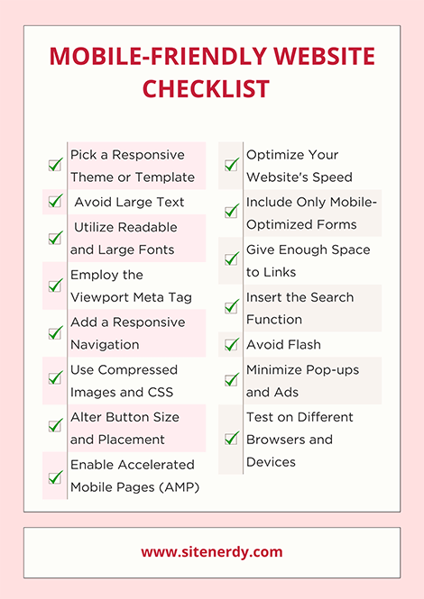
1. Pick a Responsive Theme or Template
The easiest way to make your website mobile friendly is to select a mobile-responsive theme. If your existing template isn’t responsive, then upgrade or switch to a mobile-friendly one. Further, you must update the theme regularly for more components.
Simply put, responsive themes adjust your content and media automatically to different screen sizes. As a result, your site will have a consistent user experience across all devices.

In addition, a mobile-friendly theme uses a fluid grid layout. Hence, the widths of website elements are defined in relative units (like percentages) rather than fixed pixels.
Moreover, your theme should provide simple template designs with a readable menu and a minimalist design. Also, the theme must be lightweight and fast-loading.
Did you know? Almost all website builders come with responsive design. So, you’ll have numerous options to choose from based on your requirements.
Here’s a list of criteria for choosing your responsive theme:
- Responsiveness: Ensure the theme is labeled as ‘responsive’ or ‘mobile-friendly’.
- Demo Testing: Test the theme’s demo on various devices.
- Reviews and Rating: Check if the users’ reviews and feedback are positive.
- Support and Updates: Choose a reputable platform that offers support and updates.
Using WordPress?
For instance, WordPress, the #1 Content Management System (CMS) platform provides multiple responsive themes. There can be both free and premium options available to use.
The table below shows some popular WordPress responsive themes for various site niches:
| Niche | WordPress Themes |
| Multipurpose Themes | Astra, OceanWP, Kadence, Zakra, etc. |
| Blog Themes | Writee, BlockWP, Ashe, Fairy, etc. |
| eCommerce Themes | Flatsome, TheGem, Botiga, etc. |
| Block Themes | Frost, Tove, Jace, etc. |

Learn how to choose a WordPress theme in detail over here!
Therefore, when selecting a theme or template, ensure it’s built with a responsive design in mind. The layouts and elements should adjust fluidly to different screen sizes. It’s best if they use media queries in their CSS to apply different styles based on the device.
2. Avoid Large Text
Keeping your text short and easy to read also makes your website mobile friendly. So, you must avoid using large chunks of text that make a website feel cluttered.
Follow these tips to make a website mobile friendly:
- Keep your text concise and to the point, without unnecessary details.
- Break long paragraphs into smaller sections. One paragraph should convey one idea.
- Utilize headings and subheadings to properly organize content.
- Place crucial information at the beginning of paragraphs.
- Add ‘Read More’ links to let users expand lengthy content only if they’re interested.
- Ensure the sentences are short and easier to read on narrow screens.
- Use images, infographics, or bullet points to convey information.
- Add enough white space to enhance readability.
- Keep separators to make the different sections distinguishable.
In a nutshell, you must consider employing a mobile-first content strategy. That strategy should prioritize essential information and progressively enhance content for larger screens.
3. Utilize Readable and Large Fonts
You shouldn’t use fancy fonts that are difficult to read on mobile devices. You must go for simple and legible fonts instead.
For instance, fonts like Pacifico and Lobster may make your site visually appealing. However, they are hard to read on mobile devices.
On the other hand, some standard fonts are Open Sans, Times New Roman, Proxima Nova, etc. Using these fonts, your website will be readable even on smaller screens.

Additionally, you must also consider the font size of your content. Generally, the ideal text size for the main content on mobile websites is 16 pixels. Secondary and tertiary texts, like captions and labels, can be about 12-14 pixels.
But different fonts can be more or less readable at the same size. Hence, you must test them on mobile devices before making the content live. Just set a base font size and use relative units like percentages or ems to allow for flexible scaling across devices.
What’s more? Notably, it’s better to use font colors that are visible in your website’s background.
4. Employ the Viewport Meta Tag
For beginners, the viewport is the visible area of a web page. Similarly, the viewport meta tag is a way to control its scaling so that the website shows up properly on all devices.
Remarkably, this meta tag directs browsers to adapt your web page’s width according to the screen size of your visitor’s device. So, implement this by inserting the following code snippet within the <head> tags of your HTML pages.
<meta name=“viewport” content=“width=device-width, initial-scale=1”>
Here, the ‘width’ attribute is set to ‘device-width’ because the width optimizes based on screen sizes.
Adding a responsive navigation menu is a vital step in making a website mobile-friendly. Because it ensures that users can easily navigate your website on all devices.
To obtain this, you can have a simple navigation menu on your website. Otherwise, you can also convert your complex menu into a collapsible or hamburger menu.
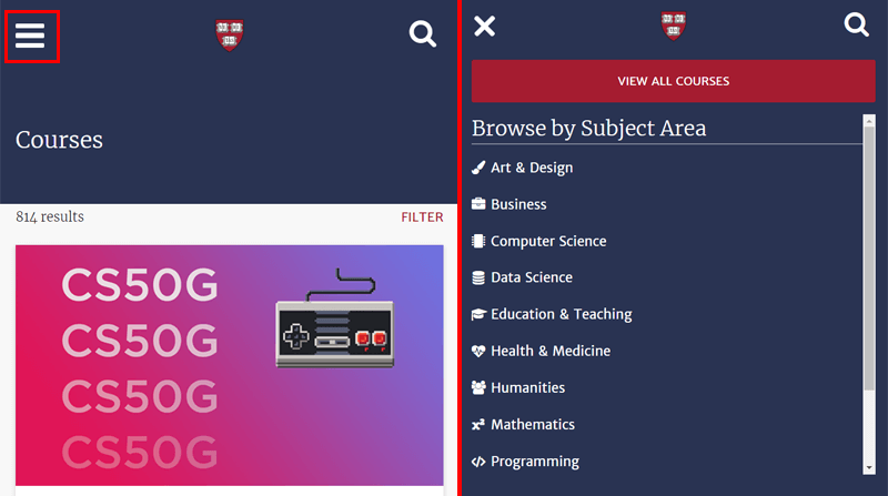
Simply put, a hamburger menu has a stacked icon with usually 3 horizontal lines. Once a user clicks on this icon, it reveals the navigation links inside.
For example, the screenshot below is from the Harvard University website. In mobile view, the menus stay inside a hamburger menu. When you click on it, all the menus show up.
That’s not all! Here are some guidelines about adding a responsive navigation menu:
- Make sure to prioritize essential menus. So, properly adjust the orders and show only the crucial menu items to focus on.
- Further, the navigation should have a touch-friendly design. Meaning, it must prevent users from accidentally clicking the wrong item.
- Using sticky navigation is beneficial. Because the menus become visible even when users scroll, this improves ease and convenience.
Read our complete guide on the best practices for website navigation here!
In WordPress, you can find several plugins specialized for creating responsive navigation. One example is the Max Mega Menu. This plugin automatically converts your menu into a mega menu that is user-friendly, accessible, and touch-ready.
6. Use Compressed Images and CSS
When you’re creating mobile websites, it becomes extra important to use images with the smallest size possible without losing quality. But why?
That’s because mobile devices have a smaller bandwidth than desktops. So, it takes more time for large image files to load. Further, loading time directly influences the user experience.

Hence, you must compress your images before uploading them to your website. Plus, the images should be saved in optimized formats like PNG or JPEG. So, the best online tool for PNG images is TinyPNG.
Suppose you own a WordPress site. In that case, you can use WordPress image optimization plugins, such as Smush, TinyPNG, WP-Optimize, etc. They automatically compress your images after you upload them.

An extra function you must consider is lazy loading. Meaning, the images should load on your website only when a user accesses them. So, if a user scrolls down, then only the image will load.
Guess what? It’s not just about images. Your files and codes should also be optimized. In a nutshell, you must compress the complicated CSS scripts and JavaScript files using developer tools. As a result, this decreases the load times of your website significantly.
7. Alter Button Size and Placement
Buttons, especially call-to-action (CTA) buttons, are crucial website elements. Since they let users take actions on your website, like adding items to their carts. That’s why buttons should be easy to find and clickable on all devices.
Most mobile users use their smartphones with one hand. Keeping that in mind, place the buttons in a convenient position. Meaning, you can add the buttons in the central location of the website rather than the corners.
That’s not all! These are some steps you must follow regarding your website’s buttons:
- Contrast color between the site background color, the button, and the anchor text.
- Adjust the button size so that it’s neither too small nor too big.
- Keep enough spaces between buttons, links, and text to prevent accidental clicks.
- The button text should be short, specific, and meaningful.
8. Enable Accelerated Mobile Pages (AMP)
AMP, short for Accelerated Mobile Pages, is a framework to help mobile devices load websites quicker. But how does it work?
AMP works by simplifying web pages to their most crucial parts and storing cached versions on Google servers. This delivers the content faster.
Further, it makes sites mobile friendly by using a streamlined version of CSS. Also, ads and videos are simplified, showing only vital images and information for quick load times. Plus, it uses enhanced HTML code that eliminates the slowdown caused by HTML tag managers.
Enabling AMP varies depending on the CMS you employ. For WordPress websites, you can use AMP plugins like AMP, which auto-creates AMP versions for your pages.

In conclusion, you must consider implementing AMP for specific content types, like blogs. This significantly improves the loading experience for mobile users.
9. Optimize Your Website’s Speed
As mentioned before, a website’s page load speed is a vital part of the user experience. Plus, both website speed and user experience are significant for sustaining mobile users.
We’ve already mentioned some measures for making a site fast and mobile-friendly. That includes lazy loading, a fast-loading theme, image optimization, minifying CSS files, etc.

Other than that, there are more steps you should consider taking. They are:
| Measures | Description |
| Redirection | Reduce the number of unwanted redirects on your web pages. Because the more redirection links, the more time it takes to load the pages.Even if you’re using redirects, ensure they work perfectly fine. Take advantage of the WordPress redirection plugins. |
| Plugins and Widgets | Remove unnecessary plugins and widgets on your website. Find the best WordPress plugins a website needs to have. |
| Pages | Minimize the number of pages your website has. |
| Browser Caching | Enable browser caching to store website components for returning visitors. |
| CDN | Use a CDN (Content Delivery Network) to load sites faster from the nearest location. These are the best CDN services. |
| Web Hosting | Select a web hosting provider with fast and reliable service for optimal speed. We recommend going with cloud hosting services, like Cloudways or Kinsta. |
Don’t know how to check your website’s speed? Online tools such as GTmetrix make it easy for you to know your website’s performance. Using them, improve your website now!
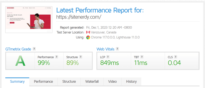
Here’s a guide on how to optimize a website’s speed. For your WordPress website, find the best WordPress speed optimization plugins here!
10. Include Only Mobile-Optimized Forms
Users may get overwhelmed when filling out forms on mobile devices if they aren’t optimized. That’s a big issue because contact forms, lead generation forms, checkout forms, etc., are vital parts of a business.
So, what are the best ways to add user-friendly forms to make a website mobile friendly? Find out from the table below:
| Best Practices | Description |
| Form Fields | Minimize the number of form fields unless it’s crucial to speeding up the process. |
| Form Length | Instead of complex or lengthy forms, keep them concise. |
| Touch-friendly Elements | Use form elements like buttons, checkboxes, radio buttons, etc. |
| Single-Column Layout | Ensure the form elements are in a single column. This eliminates the need for horizontal scrolling on mobile devices. |
| Grouping Form Fields | Group related form fields together for ease in filling out forms. |
| Scroll to Invalid Fields | Suppose there are validation errors. Then, scroll to the first invalid field to draw the user’s attention. |
| Progress Indicators | For multi-step forms, insert a clear progress indicator to show the user’s progress in the form. |
| Clear Error Messages | Give error messages and validation feedback to resolve mistakes. |
Notably, it’s best to turn off the autocorrect feature so that users’ data doesn’t get changed to common words. For that, here’s a code snippet to add in the input field of your HTML:
<input spellcheck=“false” autocorrect=“off” type=“text”/>
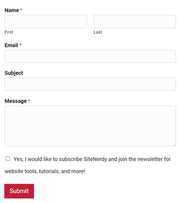
Applying these features to your WordPress website is easy with the best form builder plugins. Learn how to add a contact form to your website here!
11. Give Enough Space to Links
Among the different elements, you must also optimize links for a mobile-friendly website. As said before, you should space out your links to prevent users from accidentally clicking the wrong one. That’s crucial on mobile devices.
Apart from that, here’s a step-by-step explanation of the other techniques to follow:
- Having too many links looks cluttered and hampers the user experience. So, limit the number of links to maintain a clean interface.
- Ensure all linked pages are also mobile-optimized. Ultimately, there will be a smooth user experience throughout your website.
- Use a broken link checker to ensure that all the links on your website are functional and lead to the intended destinations.
Learn how to change link color in WordPress here!
12. Insert the Search Function
Searching for something on a website when using a mobile device is sometimes hectic. So, you must add a proper search function to enhance usability on all screen sizes.
For example, the screenshot below is of the Amazon website. Here, we can see a responsive search bar prominently at the top of the navigation.
This table shows the steps on how to add the search function to make a website mobile friendly. Let’s see!
| Search Function | Description |
| Full-width Search Bar | You can include a full-width search bar prominently for users to quickly find and utilize the search function. |
| Smaller Tab Bar | If the search function isn’t the main focus of your website, then insert a smaller tab bar that users can find conveniently. |
| Include Filters | Suppose your website has extensive content. For that, add filters for guiding people to narrow down search results. |
| Contextual Search Icon | Icons like a magnifying glass denote the presence of a search function. So, display such an icon for users to easily identify it. |
13. Avoid Flash
Adobe Flash is multimedia software that lets you create interactive content, like games, animations, and multimedia applications. Previously, it wasn’t a good choice for mobile websites because it affected their SEO and speed.
Now, many web browsers and mobile devices don’t support it due to security concerns and its discontinuation at the end of 2020. For its replacement, people are using the latest technologies, like CSS or JavaScript animations.
Moreover, you can mostly see websites using modern standards like HTML5 and WebGL for web-based multimedia content. These technologies have compatibility across various devices, including mobile.
In a nutshell, HTML5 is a versatile solution to embed movies or music and create animations. It provides a seamless experience for users accessing your website on mobile devices.
14. Minimize Pop-ups and Ads
Pop-ups and ads can help your website get more conversions. However, displaying those pop-ups and ads when users are viewing your site on their mobile devices can annoy them.
Simply put, mobile users can accidentally click on a pop-up or ad that directs them to a different page. Because of this unpleasant user experience, users can leave your website.
So, minimizing pop-ups and ads is another way to make a website mobile friendly. First, you must reduce the number of ads and pop-ups to improve the user experience. It’s better if you don’t use them at all if they’re not your primary focus.
But if you must use them, then it should be done strategically. Overall, ensure they are not obstructive and easy to close on mobile devices. Also, you shouldn’t use full-page pop-ups that block the entire screen. Why? That’s because it may be penalized by search engines.

Hence, you must adhere to web accessibility guidelines and not use intrusive pop-ups. That way, your organic search rankings will also not be affected.
How to Insert Pop-ups and Ads in a Mobile-friendly Way?
So, how can you insert pop-ups and ads to make a mobile friendly website? Here are the steps or tips to follow:
| Best Practices | Description |
| Lazy Loading | Similar to images, lazy loading can be used for other non-essential elements, like pop-ups and ads. As a result, these elements will load only when they come into the specified viewport. |
| Provide Lead Magnets | Provide lead magnets like free downloadable content, including PDF guides, ebooks, and newsletters. This encourages users to share their contact information without hesitation. |
| Slide-In Banners | Utilize slide-in banners or corner peel ads that don’t obstruct the user experience. This doesn’t hamper scrolling or time spent on the website. |
| Mobile-friendly Elements | You can place your ads or banners in a less-intrusive top area. Make sure the close button is visible and easy to use on mobile devices. |
Looking for a related plugin for your WordPress site? Here’s a list of the best WordPress pop-up plugins and the best WordPress classified ad plugins.
15. Test on Different Browsers and Devices
To ensure your website is mobile friendly, you must test it on several browsers and devices. Because your website should have consistent functionality and appearance everywhere.
First, you can manually test your website’s responsiveness. How? Just adjust the width of your browser window and observe if the website transforms into a mobile-friendly version.
Further, you can right-click on your webpage and press ‘Inspect’. There, you’ll see a toggle device toolbar option at the top. Using them, visualize how your site appears on different screen sizes.
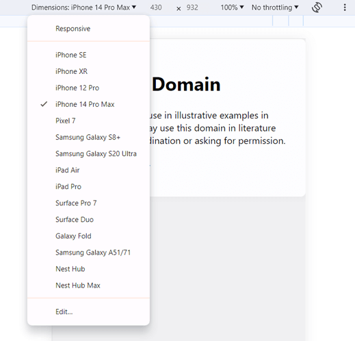
Additionally, you can use different browser developer tools, online emulators, and real devices for comprehensive testing. The following are some approaches you can utilize:
1. Google Analytics
Google Analytics lets you access how mobile-responsive your website is. Just insert your URL, and the tool will measure the user’s accessibility and navigation on mobile devices.
Using its valuable insights, you can make improvements in your website’s responsiveness. So, focus on achieving fast mobile loading speeds and a good user experience on various devices.
2. Google’s PageSpeed Insights
Using Google’s PageSpeed Insights tool, you’ll receive data about your site. That includes screenshots for both mobile and desktop views. By analyzing them, you can evaluate the loading speed score on mobile devices and address the issues mentioned for improvement.
3. W3C’s MobileOK Checker
Another tool is W3C’s MobileOK Checker. It helps you find common errors and issues related to images, graphics, resource sizes, etc. What’s more? You’ll also gain insights into pop-up issues and SSL viability.
Moreover, it provides recommendations on optimizing your site for mobile. Using them, you can resolve the issues and incorporate more features if you’re wondering how to make a website mobile friendly.
These are just a few. Whichever manual or advanced way you choose to test your website, remember to do it regularly. You can set a reminder so that your site stays mobile-friendly every time you publish new content or update the existing content.
Frequently Asked Questions (FAQs)
Quickly learn all the answers to the FAQs you may also be wondering about. Here we go!
1. What is mobile-first design, and how does it differ from responsive design?
Mobile-first design is a technique where the design process starts with the website’s mobile version and scales up to larger screens. On the other hand, responsive design begins with a design for larger screens and scales down to smaller devices.
2. Which are the best mobile-friendly WordPress plugins to use?
Some of the best mobile-friendly WordPress plugins to use are Jetpack, WP-Optimize, AMP, Smush, Max Mega Menu, etc. These plugins focus on optimization areas like speed, image, navigation, AMP, etc.
3. How can I check if my website is optimized for mobile devices?
You can check if your website is mobile-friendly using Google’s mobile-friendly test tool or other online services. These tools analyze your website and provide insights into its mobile responsiveness, highlighting areas for improvement.
4. How does a mobile-friendly website impact SEO?
Search engines like Google prioritize mobile-friendly websites in their search rankings. So, having a mobile-optimized site positively influences SEO, resulting in better visibility and higher rankings in mobile search results.
5. How can I handle mobile-friendly design for complex web applications?
To handle mobile-friendly design for complex web applications, prioritize its essential features for mobile users. For example, implement a responsive design, use collapsible menus to manage complex navigations, etc.
Conclusion
That’s the end of this article on how to make a website mobile-friendly. Hopefully, it equipped you with valuable insights on building a mobile-friendly website.
Mobile friendliness is not just a technical necessity. But it’s a key element in improving your online presence and user engagement. So, follow all these steps on your website.
Which mobile-friendly strategy resonates with you the most? Did we miss any techniques that you’re aware of? Share your thoughts and knowledge about it in the comments below.
Also, if you have any queries or need further guidance, then reach out to us without hesitation. We are here to assist you in every way possible with a mobile-friendly website.
For more in-depth information on similar topics, explore our insightful articles. They are how to get more Google Reviews for your business and how to use AI in websites to make improvements.
Stay connected with us on our social media accounts on Facebook and Twitter.


