Are you wondering about the best practices for website navigation so your visitors won’t get lost? If yes, then don’t go anywhere.
When it comes to website design, one of the most important aspects to consider is navigation. A website’s navigation can either make or break a user’s experience, which could ultimately affect the site’s success.
Thus, we’ve brought you the key 10 best practices for website navigation to help you create a seamless user experience. Along with real website examples that are doing it right.
With these techniques, you can ensure that your website visitors can easily find what they’re looking for. Ultimately, leading to increased engagement and conversions.
Let’s dive in!
Before moving forward, let’s explore some of the benefits of good website navigation.
- Enhanced User Satisfaction: Simple navigation ensures users find what they need easily, boosting their satisfaction. And satisfied users tend to revisit and recommend your site to others.
- Reduced Bounce Rate: Effective navigation decreases bounce rates, as users quickly access relevant information. Further, this discourages premature exits from the site.
- Better Conversions: Streamlined navigation contributes to improved conversions. Easy information access encourages users to take desired actions, like purchasing or subscribing.
- SEO Benefits: Website navigation impacts SEO (Search Engine Optimization) rankings. Strong navigation can elevate your site’s search ranking, resulting in increased organic traffic.
- Enhanced Brand Credibility: Clear navigation enhances brand reputation. An organized, user-friendly site reflects credibility and trustworthiness, boosting user confidence.
Overall, good website navigation is essential for any website that wants to provide a positive user experience and improve its SEO rankings.
Having said that, let’s move forward to explore the best practices for website navigation.
Did you find yourself here by accident? Do you have intentions of creating your own website? If so, then take a look at our all-inclusive and easy-to-follow guide to crafting a website.
Now, let’s check out some of the best practices for website navigation along with real-world website examples. So, whether you’re a web designer, developer, or site owner, putting these strategies into practice can help you advance your site.
Now, get ready to elevate your website’s user experience and increase engagement like never before.
1. Adopt the Motto ‘Less is More’
When it comes to website navigation, the age-old saying ‘Less is More’ holds true.

As users are more likely to be overwhelmed and confused if there are too many options in the navigation menu. Instead, focus on providing a few key navigation options that are relevant to your website’s content and audience.
How to Implement ‘Less is More’?
To adopt the mantra of ‘Less is More,’ you can do the following:
- Create a navigation menu that focuses on the most important pages and actions.
- Eliminate confusion and allow your users to find what they need quickly.
- Enhances the visual appeal of your website. Plus, it makes it user-friendly and improves overall engagement.
Example:
Consider the popular website example of Apple. Take a moment to visit their website and notice how their navigation is minimalist yet effective.
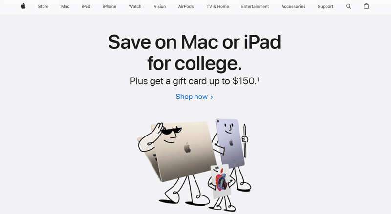
With just a few carefully chosen categories, they manage to present a clear and concise menu. That allows visitors to effortlessly navigate through their products and services.
As a result, this makes it easy for users to find what they’re looking for, even if they’re not familiar with the website.
Takeaways From the Example:
So, take a step back and evaluate your website navigation. And ponder:
- Are there any unnecessary or redundant options?
- Can you simplify your menu by condensing similar pages into dropdown menus or subcategories?
Remember, by embracing the principle of ‘Less is More’, you can create a streamlined and intuitive navigation experience for your visitors. Ultimately, making their journey through your website a breeze.
2. Be Specific
When it comes to website navigation, being specific is key. Your users should never have to guess or wonder where a particular link will take them.

Clear and descriptive labels for your navigation menu items can greatly improve the user experience. And help users find what they are looking for within a short time span.
For instance, consider that you have an eCommerce website. So, instead of using a navigation option like ‘Products’, you can use more specific options like ‘Shoes’, ‘Clothing’, or ‘Accessories’.This will help users quickly find the products they’re interested in.
How to Be Specific in Website Navigation?
Here are some tips for being specific when naming your navigation options:
- Use keywords that are relevant to your website’s content.
- Write with clear and concise language.
- Avoid using jargon or technical terms.
- Use the same language throughout your navigation menu.
- Utilize subheadings to further categorize your navigation options.
By following these tips, you can create navigation options that are clear, concise, and easy to understand. This will help users to find what they’re looking for quickly and easily.
Example:
One fine example of such a website that follows this practice is ‘Glossier’. It’s the skincare brand website that presents its navigation being specific.
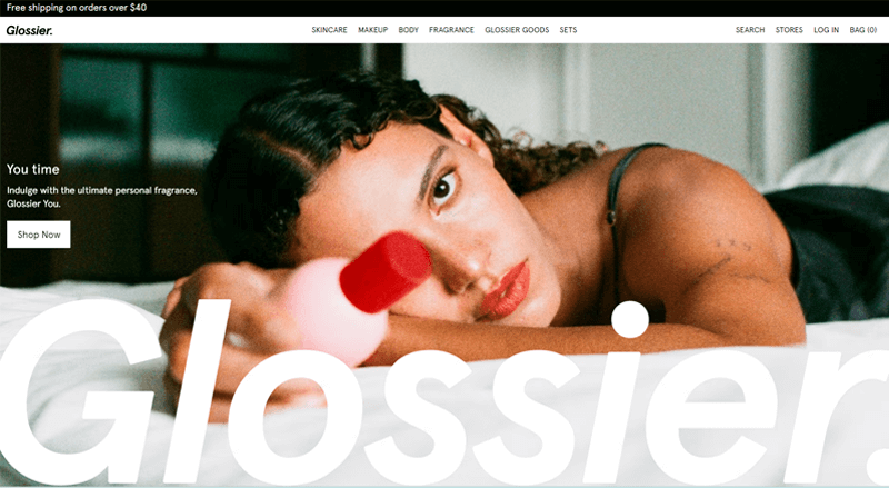
As you visit their website, you’ll notice how their menu items are not only straightforward. Plus, it provides a clear indication of what you will find on each page.
Whether it’s ‘Skincare’, ‘Makeup’, ‘Body’, or ‘Fragrance’. Glossier’s navigation labels leave no room for ambiguity. Further, allowing users to navigate their site effortlessly.
Takeaways From the Example:
So, take a step back and evaluate your website navigation. And implement the following practices:
- Carefully consider the purpose of each page on your website and create labels that accurately reflect their content.
- Avoid generic terms and opt for more specific labels that clearly describe where exactly it will take to users.
- Consider using action-oriented labels for navigation items where applicable.
Hence, by being specific in your website navigation, you provide a seamless user experience. Along with building trust and credibility among your visitors.
Remember, clear and descriptive labels are the signposts that guide users to their desired destinations. Further, ensuring a positive user journey from start to finish.
3. Link Back to the Home Page with Your Logo
An important and often overlooked best practice for website navigation is linking back to the home page with your logo.

Today, website visitors have come to expect that clicking on a company’s logo will take them back to the home page. By incorporating this functionality, you provide users with a convenient and intuitive way. To navigate back to the starting point of your website.
How to Link Back to the Home Page with Your Logo?
Here are some tips for linking back to the homepage with your logo:
- Make sure your logo is always visible on your website. Plus, ensure it’s linked to the homepage.
- Place your logo in a prominent location, such as the top or left-hand side of your website.
- Make sure your logo is responsive so that it looks good on all devices.
- Use a hover effect to change the appearance of your logo when users mouse over it.
Example:
Let’s take our own website SiteNerdy as an example.
As you visit our website, you’ll notice that our logo is prominently placed in the top left corner of the header. Clicking on the logo instantly takes you back to the home page. Further, providing a consistent and reliable way for users to navigate within the site.

This simple yet effective practice saves you from having to search for a ‘Home’ button or trying to figure out how to return to the main page.
Takeaways From the Example:
Summing up, you should precisely take care of the following things:
- Ensure that your logo is prominently displayed at the top of your website, preferably in the header section.
- Make sure that the logo is linked to the home page. This way, users can easily recognize and utilize this familiar function to navigate back to the start of their journey.
Hence, by linking back to the home page with your logo, you provide users with a seamless and intuitive way to navigate your website.
This small but essential feature not only improves user experience. But also reinforces your brand presence and makes it easier for visitors to explore all that your website has to offer.
When it comes to website navigation, it’s essential to make your primary navigation stand out.

Primary Navigation refers to the main menu that guides users to the most important sections or pages of your website. And you must always make it visually distinct and easily accessible. So that users can quickly find and navigate to the key areas of your site.
How to Make Primary Navigation Stand Out?
There are a few things you can do to make your primary navigation stand out:
- Use a different font or color for your primary navigation links than you use for the rest of your website content.
- Make your primary navigation links larger than the rest of your website content.
- Place your primary navigation links at the top of the page, in a prominent location.
- Use a clear and concise label for your primary navigation links.
Example:
Let’s take a look at the website for McDonald’s as a demo.
As you visit their website, you’ll notice that the primary navigation menu is placed prominently at the top of the page. On top of that, it uses specific colors for Order Now and even places a symbol for changing your location.

This design choice immediately draws attention to the navigation and makes it clear that it’s the main way to explore the website.
Takeaways From the Example:
Summing up, take a step back to implement the following practices:
- Position your primary navigation menu prominently on your website, usually at the top of the page. Users expect to find navigation options in this area, so it’s essential to follow this convention.
- Use visual cues to make your primary navigation stand out. This can include using a different font, color, or background to highlight the menu items.
- Make sure the menu is visually appealing while remaining easily readable and accessible.
- Keep the design of your primary navigation consistent throughout your website. This includes using the same font, color scheme, and layout across all pages.
Hence, you need to work on making your primary navigation stand out. So, users can quickly find and access the most important sections of your website.
Plus, you cannot overlook the fact that a visually distinct and prominent navigation menu enhances the user experience. Along with reducing frustration, and encouraging visitors to explore further. Ultimately leading to higher engagement and conversions.
5. Keep Header Options to a Minimum
As mentioned in Practice Point 1, ‘Less is More’ when it comes to website navigation.

Users are more likely to be overwhelmed and confused if there are too many options in the header navigation. Instead, focus on providing a few key navigation options that are relevant to your website’s content and audience.
How to Keep Header Options to a Minimum?
To optimize website navigation, it’s important to keep header options to a minimum. Here are some tips you can follow to do so:
- Only include the most important navigation options in your header.
- Use clear and concise language for your header links.
- Group related navigation options together.
- Use a dropdown menu to show additional navigation options.
Example:
Let’s take a look at the popular social networking website Pinterest, as an illustration. On this website, you’ll notice that the header is sleek and uncluttered. With only 3 primary options: ‘About’, ‘Business’, and ‘Blog’.

By limiting the header options, Pinterest ensures that visitors can quickly identify the main sections of the website. And navigate without any distractions.
Takeaways From the Example:
Hence, make sure you have properly implemented the following practices:
- Identify the most important sections or pages of your website and include them in the primary navigation menu.
- Avoid overwhelming visitors with too many options. Keep the number of header menu items to a minimum, ideally less than 6 or 7.
- For lesser essential pages, use secondary navigation or a menu within the content area.
By keeping header options to a minimum, you enhance the usability and clarity of your website navigation. Visitors can easily find the key sections they are looking for. Ultimately, this leads to a smoother user experience and better engagement with your content.
Once again, remember that less is often more when it comes to website’s navigation. Focus on what truly matters to your users and streamline your header accordingly.
When visitors land on your website, their first instinct is to swiftly grasp its structure and locate the information they seek. Visual cues play a pivotal role in guiding users through this process seamlessly.

How to Use Visual Cues for the Navigation Hierarchy
Here are some effective strategies and examples to employ visual cues for well-structured navigation.
- Use contrasting colors to instantly draw the user’s attention.
- Implement larger fonts or icons for primary categories and smaller ones for secondary or tertiary links.
- Use typography to differentiate between navigation levels while maintaining a consistent style.
- Implement animations like highlighting or slight movement upon hover sparingly and consistently across the navigation items.
Example
To illustrate, let’s observe Amazon, a prominent online retailer, and how they leverage visual cues:
Amazon employs concise labels like “Electronics,” “Books,” and “Fashion” for their main categories.
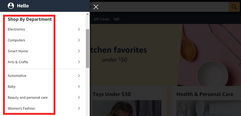
So, when users hover over these categories, dropdown menus materialize, revealing subcategories. This approach, known as progressive disclosure, allows users to explore deeper levels of content without overwhelming them.
Takeaways From the Example
Here are some key takeaway points from the example provided about Amazon’s use of visual cues in website navigation:
- Implementing dropdown menus upon hovering over the main categories exemplifies the concept of progressive disclosure.
- Incorporate icons to establish a visual hierarchy in its navigation system.
- Use the dropdown menu to facilitate deeper dives into specific content areas.
By harnessing the power of visual cues, websites can evolve from mere destinations to immersive journeys. Inviting users to explore, discover, and engage in ways that leave an indelible mark.
7. Add a Search Bar
A search bar can serve as a guiding line for users on your website. It’s a vital element that empowers users to bypass the mess of menus and directly access their desired content.

This tool, often represented by a magnifying glass icon, exemplifies efficiency and convenience.
How to Implement a Search Bar
- Position the search bar at a visually prominent location, preferably in the header section.
- Implement a predictive search functionality that offers autocomplete suggestions as users type.
- Use a distinct design for the search bar, like a contrasting color or a well-defined border.
- Ensure that the search bar remains functional and well-structured across all devices, from desktops to smartphones.
- Utilize filters and sorting options to enable users to refine their search further.
Example
Let’s take a look at how Amazon masterfully integrates its search bar into its website.
The Amazon search bar is prominently placed at the top of the homepage, right beside the logo. The magnifying glass icon is universally recognized as a symbol for search, making it instantly comprehensible for users.
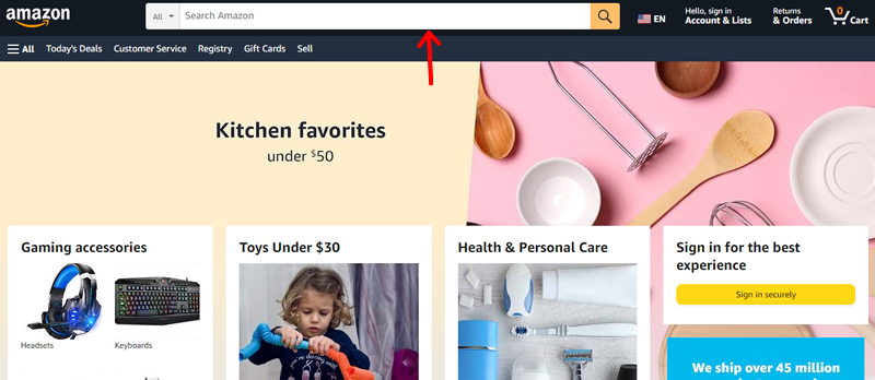
Moreover, as you type a query, it provides a dropdown of suggestions, making the search process quicker and more user-friendly. Upon hitting Enter, users are led to a dedicated search results page, presenting a plethora of products that align with their search terms.
This showcases Amazon’s commitment to enhancing the user experience through effective navigation tools.
Take Away From the Example
- Position your search bar prominently, preferably near your logo, for easy access.
- Utilize universally recognized icons like the magnifying glass for search functionality.
- Enhance the user experience by offering dropdown suggestions as users type in their queries.
- Lead users to a dedicated results page for their search, showcasing relevant content.
By adapting these practices, you empower your users to seamlessly explore your website and discover the content or products they desire.
Website navigation isn’t limited to just the header. Often overlooked, the footer presents a golden opportunity to enhance user engagement and navigation convenience.
Besides, footers are traditionally relegated to copyright information and disclaimers. However, modern websites are leveraging the power of the footer for so much more.
How to Add a Fat Footer
By strategically integrating relevant links, and contact details, a fat footer can transform into a secondary navigation hub. Let’s see how you can do so!
- Curate a selection of the most important links that users might need even after scrolling through your content.
- Structure the fat footer using clear headings and subheadings to categorize the links.
- Incorporate essential contact details, like an email address, phone number, and physical address.
- Implement a condensed version of your primary menu in the footer.
- Embed social media icons that link to your official profiles. Offer supplementary resources like FAQs, customer support pages, or a sitemap.
Examples
- Apple: Apple’s website incorporates a sleek fat footer that features links to their various product lines, services, and support options, making it easy for users to explore their ecosystem even after reaching the end of a page.
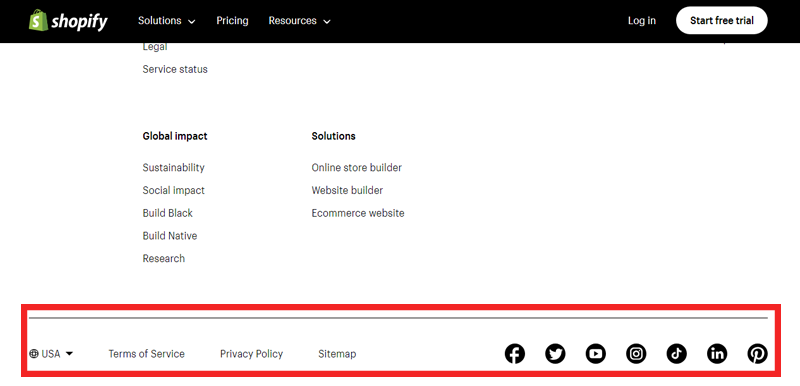
- Shopify: Shopify’s fat footer seamlessly integrates essential links like their pricing, features, and partner resources, enabling users to swiftly access key information.
- HubSpot: HubSpot utilizes a fat footer to offer users quick access to their platform’s key features, along with navigation links and contact information, enhancing user navigation convenience.
Takeaways from the Example
As we’ve explored the incorporation of visual cues to establish hierarchy within website navigation, the examples provided offer valuable insights for enhancing the user experience:
- Consider integrating a fat footer into your website’s design to offer users additional navigation options.
- Prioritize user navigation convenience by using visual cues.
- Embrace whitespace strategically to visually separate different levels of navigation, preventing clutter and confusion.
Remember, it’s all about creating a harmonious balance between design aesthetics and functional convenience to leave a lasting positive impression on your audience.
In an era where users access websites from an array of devices. Spanning from desktops and laptops to tablets and smartphones. Therefore, responsive navigation stands as an integral facet of modern web design.

How to Use Responsive Navigation
Responsive navigation ensures that your website’s navigation adapts fluidly to different screen sizes and orientations. Hence, granting users an equally captivating experience across platforms.
Moreover, responsive navigation doesn’t merely entail rearranging menu items, it also involves:
- Optimizing touch targets for mobile users.
- Elements become larger and more fingertip-friendly.
- Reducing the chances of accidental clicks and improving overall interaction.
- Consistent experience regardless of how they interact with your website.
Example
Consider the travel giant Airbnb, which excels in responsive navigation. Upon resizing the browser window or accessing the site from a mobile device, Airbnb’s navigation transforms elegantly.
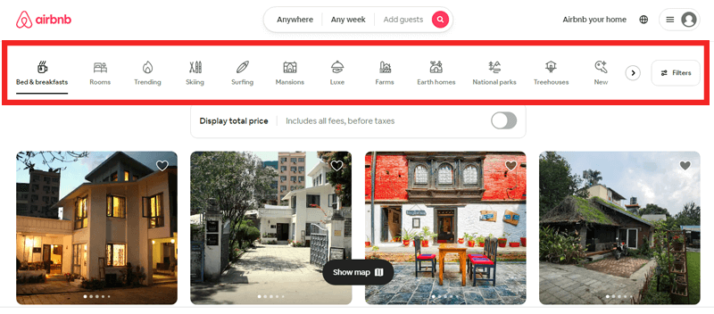
Moreover, the menu condenses into a sleek and easily accessible hamburger icon. Maintaining its functionality while conserving screen real estate. This practice ensures that users can seamlessly navigate and explore listings regardless of their chosen device.
Take Away From the Example
- Implement responsive navigation that adapts gracefully to different screen sizes and devices.
- Ensure your menu remains functional and accessible, providing a consistent user experience regardless of the platform.
- Prioritize clean and intuitive design choices that enhance the user experience while conserving valuable screen real estate.
Your website’s navigation isn’t just a layout, it’s an invitation to explore, engage, and ultimately, convert. So, take these best practices and craft a navigation system that speaks volumes about your dedication to user satisfaction.
10. Use Familiar Structure and User-friendly Language
Navigating a website should feel like second nature to users, and this begins with a familiar structure and user-friendly language. Employing conventional navigation patterns ensures that visitors can effortlessly find their way around your site.

How to Use Familiar Structure and User Friendly Language?
Here are some tips you can follow:
- The first step towards seamless navigation is embracing familiar structural elements.
- Incorporating a universally accepted placement for navigation menus, like the header or sidebar, fosters a sense of comfort.
- Crafting navigation labels in a language users readily understand fosters a connection.
- Avoid cryptic jargon that might alienate visitors.
Hence, blending recognizable design with user-friendly language goes beyond just looks. This smoothness reduces thinking effort, letting users concentrate on the important content. Eventually leading to a better user experience.
Example
A perfect example of a familiar structure and user-friendly language is the e-commerce website, Amazon.
Its consistent layout, featuring the logo on the top-left, a search bar in the center, and a menu bar just below, demonstrates an innate understanding of user behavior.
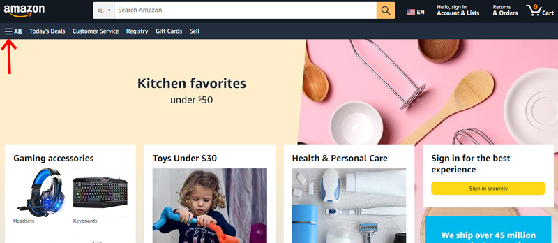
This layout resonates with countless users, underscoring the importance of familiarity.
The path to seamless website navigation is presented by the combination of various practices. This helps users forge a connection with your website. Embarking on a journey of discovery and engagement.
Take Away From the Example
The Amazon example vividly demonstrates the impact of familiarity, strategic placement, and user-centric design. So, here are some tips for you to implement.
- Create a consistent layout, with logo placement, search bar, and menu, that showcases the power of familiarity in navigation design.
- Understand your user behavior to ensure the website’s layout resonates with countless users.
- Make use of familiar structures to create a connection between users and your website.
So, take note of these insights to create a navigation experience that resonates with your audience.
Do check our article on common WordPress mistakes and the best ways to avoid them.
Frequently Asked Questions (FAQs)
Website navigation is the roadmap users follow to explore content. Intuitive navigation enhances usability, reducing frustration and promoting engagement.
Overloading menus, ignoring mobile responsiveness, inconsistent placement of menus, and poorly labeled links hinder understanding. Avoiding these mistakes ensures a seamless navigation experience.
Responsive design adapts your website to different devices, enhancing navigation across screens. Elements rearrange, ensuring clarity and functionality on small screens. This adaptability keeps menus accessible optimizing user experience regardless of device.
Navigation menu placement impacts user engagement significantly. Familiar positions like the header or sidebar offer consistency, aiding user orientation. Also, strategic placement ensures easy access to key content, improving user satisfaction.
Descriptive labels provide a clear context, aiding users’ understanding of their destination. Plus, precise labels like “Services” instead of “Offerings” eliminate confusion.
Usability testing involves real users navigating your site. Analyze their interactions, noting confusion or roadblocks, aiding design refinement. Metrics like bounce rate and average session duration quantify navigation success.
Conclusion
That’s it! We’re at the end of this article on best practices for website navigation. Hope you enjoyed it and agree with our list of website navigation best practices.
As said before, your website’s navigation is not just a map, it’s an invitation to go on an unforgettable expedition. So, by embracing the art of website navigation practices, you’ll create a satisfying online journey for your audience.
Moreover, you can comment with your queries on our post as well. We’ll be more than happy to help you.
In addition, please read our insightful guides on how to change footer text and background color in WordPress and how to add a logo slider in WordPress.
Do share this article with your friends and family who’re looking for best practices for website navigation.
Lastly, you can follow us on Facebook and Twitter to get updates on new helpful blogs.
