Ever wondered how to make your website accessible to everyone? If yes, then you’re in the right spot.
Website creation is not just about attractive design but also about inclusivity. So, you must ensure that your website is accessible to all users, including those with disabilities.
This article unpacks 19 tips that can significantly enhance your website’s accessibility. Hence, these tips will help you make a site that welcomes and accommodates everyone.
Now, without any delay, let’s get right into it!
Table of Contents
What is Web Accessibility? Why is it a Priority?
Before we begin, here’s a quick explanation of web accessibility and its significance.
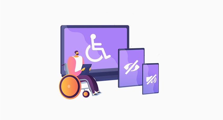
Web accessibility is the practice of ensuring that websites are designed and implemented for the benefit of people with disabilities. It lets these people perceive, understand, navigate, and interact with the content effectively.
Therefore, the main aim of an accessible website is to become an inclusive online platform. As a result, it’s usable by everyone, regardless of their physical or cognitive abilities. So, an accessible site focuses on disabilities like impairments of visual, hearing, motor, etc.
Check out the best accessible website examples to get inspiration!
Other than inclusion, making a website accessible is vital for these reasons:
- Legal Compliance: Many countries require your site to comply with legal standards related to web accessibility, like Web Content Accessibility Guidelines (WCAG).
- Market Benefits: An accessible site helps your business reach a broader audience, including disabled people. This increases user engagement and business reputation.
- Search Engine Optimization (SEO): Using accessibility practices also benefits the overall site visibility. For example, using descriptive alt text and captions for images.
- Ethical and Social Responsibility: An accessible website shows your commitment to providing equal opportunities and access to information for everyone.
Thus, web accessibility is one of the essential elements of a good website you must know.
Following that, let’s jump into our main focus!
Video Tutorial – Make Your Website Accessible
Attention to those who don’t have time to read the entire post! Here’s a quick video tutorial on YouTube that sums up all the tips on how to make your website accessible.
Do you want to learn the process in detail? Then, better keep reading our guide! Let’s go!
How to Make Your Website Accessible? (19 Tips)
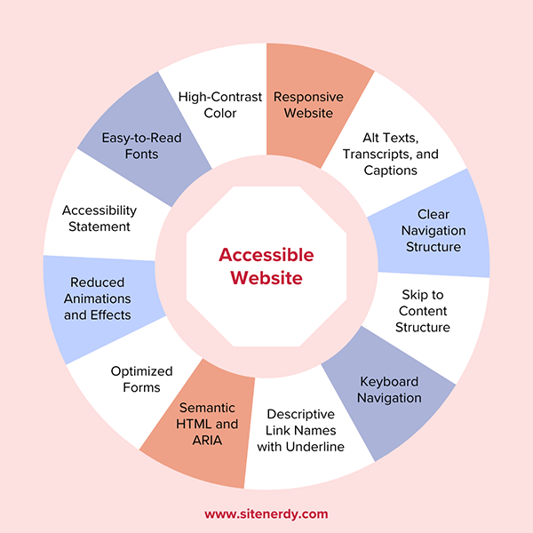
Web accessibility is significant for creating a holistic online website experience. So, you must consider all the components that an accessible website should have when creating one.
Thus, here are the 19 tips on how to make your website accessible. Try incorporating all of them to provide a user-friendly website for people with abilities and disabilities. Let’s start!
1. Choose Easy-to-Read Fonts
First and foremost, you must choose easy-to-read fonts to make your website accessible to a diverse audience. That includes those with visual impairments or other accessibility challenges. So, pay attention to selecting and implementing fonts on your website.
Specifically, you must select the right font families, size, and other criteria for visible content. Here are some guidelines to follow:
| Guidelines | Description |
| Font Family | Choose a font type that is easier to read on different screen sizes, like Arial, Helvetica, Verdana, Open Sans, etc. So, don’t go for decorative or overly stylized fonts that are difficult to read for anyone. |
| Font Size | Utilize a font size that makes your website content easily readable on each device. This can be about 16 pixels for body text. Moreover, you can let your visitors adjust the font size based on their requirements. |
| Line and Letter Spacing | It’s ideal to keep adequate line spacing throughout your content to make your website accessible. In addition, you must not add excessive letter spacing that hinders readability. |
| Font Style | If you want to emphasize crucial information, then you can consider using different font styles. This includes bold text or underlines. |

2. Pick a High-Contrast Color Scheme
Right beside your font selection, you must also pick a contrasting color for your text and website background. In simpler words, you should choose a high-contrast color scheme for creating an accessible website. For that, here are some considerations:
| Guidelines | Description |
| Color Contrast Ratio | There must be enough color contrast ratio between text and its background to make your content distinguishable. WCAG recommends it to be 4:5:1 for normal text and 3:1 for large text. Here’s its guide. |
| Avoid Low Contrast | If you use low-contrast combinations, then it’ll make it difficult for users with visual impairments to distinguish between elements. For example, you must avoid light gray text on a white background. |
| Test with Grayscale | You can convert your website to grayscale for testing purposes. This lets you simulate the experience of color-blind people, helping you recognize the areas where you must adjust the color settings. |
| Utilize Color and Text Together | Colors can help people to understand the information you’re providing. So, you can use it for crucial elements like buttons and links. For instance, utilize a red color for an error message elaborating on the issue. |
For instance, SiteNerdy uses dark font color in light background color. Looks good, right?

Do you want to change the footer text and background color in your WordPress website? Then, here’s a quick tutorial just for that.
3. Build a Responsive Website
Smooth user experience is a crucial factor for making an accessible website. For that, your website must be responsive.
A responsive design lets your website adapt to every screen size and device for a seamless experience every time users access your site. With a responsive design, your content becomes accessible to a broader audience.
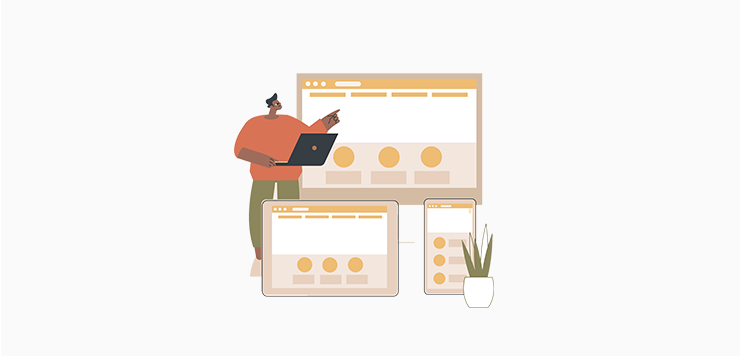
Similarly, you must test your site on different browsers to ensure a consistent performance. This lets users with disabilities use their comfort browser and gain a seamless experience.
Learn how to make a mobile-friendly website in this ultimate guide.
4. Upload Images with Alt Text
Adding alt text to your images while uploading also lets your website be accessible. For beginners, alt text (short for alternative text) provides a textual description of images.
Overall, it helps people with visual impairments or those using assistive technologies like screen readers understand the content and context of the images.
Don’t know where and how to add the alt text? Here’s a quick tutorial below!
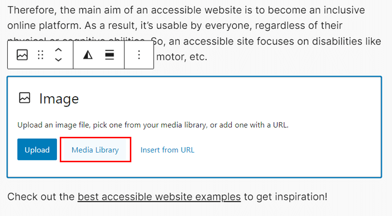
Suppose you’re using WordPress for your website. Then, simply add an image block on the page or post editor and click the ‘Media Library’ button.
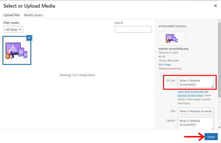
There, upload the image and you’ll find a section to insert the alt text. So, simply input the alt text and save the image by clicking ‘Select’. That’s it!
The process is similar in other CMS (Content Management System) platforms and website builders. But remember these things:
- The alt text should be concise but descriptive. Meaning, it must provide enough details about the image in short.
- You must not insert irrelevant details in the alt text that don’t justify the image.
- If the images are just for decorative purposes, then leave the alt text empty.
- Suppose your website contains dynamic or interactive content, including images. Then, ensure you update the alt text to reflect the changes.
- Further, you can explain your complex images on your web page or post if required.
5. Add Transcripts and Captions for Multimedia
Do you include audio or video content on your site? If yes, then are they made accessible?
Adding transcripts and captions for multimedia also helps you achieve an accessible website. This is especially focused on people with hearing impairments.
First, transcripts are text versions of the audio content for letting people with hearing impairments understand it. On the other hand, captions are text on the screen for spoken words guiding users with difficulty in hearing to understand the content.
If you’re adding audio and video content, then create written transcripts and captions. Moreover, you can let the visitors turn this function on or off as per requirement.
For instance, you insert your YouTube videos on your website. Did you know? YouTube can automatically generate captions for your videos. However, you must check them for accuracy and relevancy.
Hence, you should ensure that transcripts and captions are compatible across different devices and platforms, synchronized, and working perfectly.
6. Provide a Clear Navigation Structure
Web accessibility also involves creating a website with proper design and structure. This lets people with disabilities navigate and interact with your website.
Hence, you must provide a clear navigation structure on your accessible website. To do so, organize your website content logically and consistently. You can group related information and use headings that help people understand the content hierarchy.
For instance, BBC is an accessible news website. Its navigation includes menu items for the different topics it covers the news of. This lets the visitors easily access the news they want to learn about.
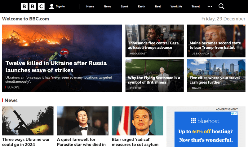
In addition, you must maintain a consistent navigation menu across all pages. With that, users can predict where to discover specific information.
Another technique is to implement breadcrumb navigation. This shows visitors their current location within your website’s hierarchy. As a result, users can understand the structure of your website and easily navigate back and forth.
Find the best practices for site navigation that you should not miss out on for accessibility.
7. Implement Skip to Content Structure
Adding a ‘Skip to Content’ link is beneficial to make your website accessible. It lets users skip repetitive navigation and jump right into the main page content.
To implement the ‘Skip to Content’ option, you must identify the content area where you’ll include it. This section is the location where users can skip and directly move forward. Generally, this link is added at the beginning of your page.
For example, the Patreon website has a skip-to-content option that lets people directly move to the body content skipping the header.
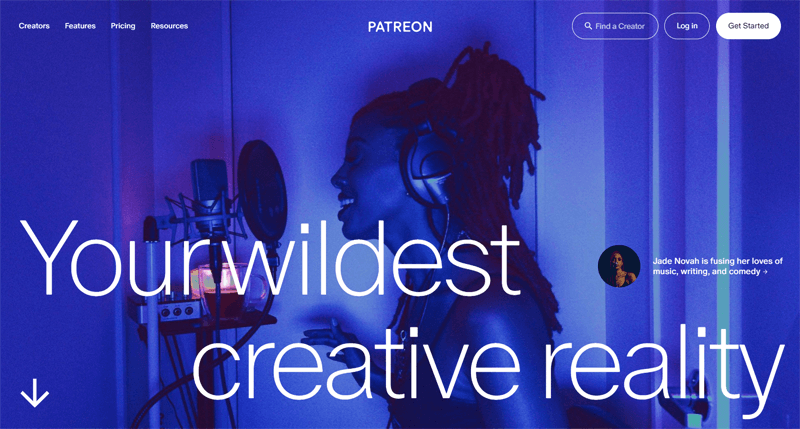
Notably, it’s advantageous for people who rely on assistive technologies like screen readers or those who use keyboard navigation. So, remember to construct it in such a way that this content skip function works well on assistive technologies and keyboard navigation.
8. Establish Keyboard Navigation
Many people with disabilities rely on keyboards or other input devices to navigate through websites. So, you must establish keyboard navigation to make your website accessible.
The following are some of the steps to achieve keyboard navigation for web accessibility:
- Let users press the ‘tab’ key to navigate through links, buttons, and form fields. So, create a logical tab order for navigation against your site’s interactive elements.
- Utilize distinguishable focus styles for those interactive elements that get keyboard focus. Now, people can understand which component they’re currently selecting.
- Also, you can let users interact with those elements using the ‘Enter’ key or other keyboard commands to perform actions. For example, clicking a button with ‘Enter’.
- Provide unique keyboard shortcuts in a location using which users can utilize them.
- Give documentation or a user guide about the keyboard navigation of your site.
9. Utilize Descriptive Link Names
Moving forward, website accessibility involves utilizing concise yet descriptive link names. These meaningful texts for your links should accurately describe the destination or action. So, it mustn’t be just ‘Click Here’ or ‘Read More’.
Similarly, you should use consistent language and tone for your links as in the site content. Ultimately, visitors can comprehend the context and purpose of the link better.
Further, it’s better not to have multiple links on your webpage that point to the same destination. But if you have to, then rather use ARIA landmarks that skip repetitive content.
10. Implement Underline Links Structure
As mentioned before, link structures are crucial for users with disabilities to navigate the website content. One way to improve link accessibility is to utilize clear and consistent visual cues, like underlines to denote the link’s presence.
In simpler words, you can use underlines for hyperlinks of your website by default to distinguish them from regular text. Other than that, here are some tips to follow:
- Keep the styling of links consistent throughout your website, including the same color, font, and underline styling.
- Don’t underline other content on your site with the same styling to avoid confusion.
- Ensure the link color and background color of the page or post have enough contrast.

Learn how to change the link color in WordPress here!
11. Use Semantic HTML
Semantic HTML refers to the use of HTML elements for browsers and developers to understand the structure and content of pages. This can make your site accessible because your structured content becomes easily understood by users and assistive technologies.
The table below shows some ways to use semantic HTML to make a website accessible:
| Semantic HTML | Used for |
| <header> | Website header |
| <nav> | Navigation menu |
| <main> | Main page content |
| <section> | Group of related content |
| <footer> | Website footer |
| <h1> to <h6> | Heading tags where <h1> is the main heading followed by other subheadings. |
| <ul>, <ol>, <li> | Organizing content in list format. |
12. Include Optimized Forms
Every website has forms to gather user information and build user interactions. When optimizing your site for accessibility, you must ensure that the forms accommodate disabled individuals. Hence, you must apply certain techniques for inclusive forms on your website.

- Add descriptive labels for each form field so that users understand the aim of inputs.
- Keyboard–accessible forms help to build user interaction when using the keyboard.
- Create the required validation checks so that people provide valid input. To make it more accessible, you can offer suggestions or autocomplete options.
- Provide clear instructions at the beginning of the form. Also, offer descriptive error messages when visitors make mistakes or require suggestions for correction.
- Utilize various input methods, like speech recognition software and screen readers.
- Ensure the forms are responsive and use the right color contrast for better visibility.
Find the best WordPress form builder plugins. Also, learn how to add a contact form to your WordPress website using one of the best WordPress contact form plugins.
13. Use ARIA
ARIA (short for Accessible Rich Internet Applications) are attributes for HTML elements. They provide additional information to assistive technologies in understanding the structure and functionality of web content.
Here are some common ways on how to add ARIA attributes to HTML elements on syntax:
| ARIA Attributes | Description | Example |
| Role | Elaborates the purpose or type of an HTML element. That includes buttons, navigation, etc. | <button role= “button”> Click Here!</button> |
| Properties | Give information about the element’s state. | <input type = “text” aria-label= “Enter Name”> |
| States | Represent the current state of an element, like ‘expanded’, ‘disabled’, ‘selected’, ‘checked’ etc. | <input type= “checkbox” aria-checked= “true”> |
Therefore, you must utilize the semantic HTML components for web accessibility. In addition, you can complement its functionality by adding necessary ARIA attributes.
14. Reduce the Use of Effects and Animations
Using effects and animations may enhance your web design and the user experience. However, it’s not ideal for those who have disabilities. So, reducing the use of effects and animations on your website can significantly improve its accessibility.
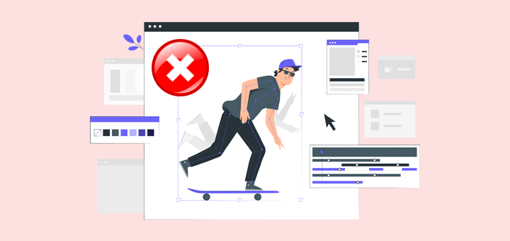
These are some reasons why minimizing effects and animations on your site is beneficial:
- Excessive animations and effects can distract those with attention disorders and cognitive impairments. So, minimize them for a straightforward experience.
- Limiting animations reduces the discomfort people face due to motion sensitivity and generates a more comfortable browsing experience for everyone.
- A website with heavy use of animations slows down its loading times. So, consider this if you want a high-speed website that’s key to excellent user experience.
- Further, animations and effects can make keyboard navigation challenging. Hence, it’s ideal to reduce their usage for efficient keyboard navigation.
- Why risk adding animations and effects if they don’t support older browsers and devices? Adding them may just reduce your target audience reach.
15. Compliance with Web Accessibility Standards
Once you apply all the above-mentioned strategies, recheck that your website is compliant with the web accessibility standards. For example, WCAG provides clear guidelines for accessible websites, covering multiple aspects like color contrast, keyboard navigation, etc.
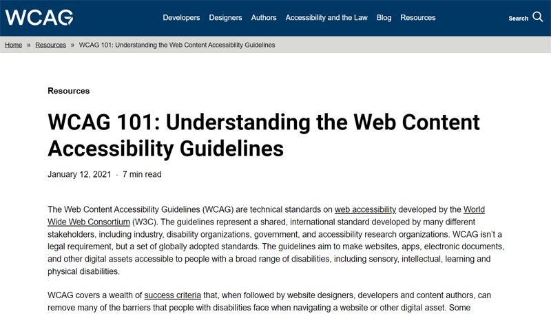
If you follow them, then your website will have legal compliance with the accessibility laws and regulations. So, this compliance can reduce the risk of lawsuits and legal actions related to accessibility barriers.
For instance, the US lets website owners follow the ADA (Americans with Disabilities Act) and EU countries follow the European Union Web Accessibility Directive.
16. Insert an Accessibility Statement
The cherry on top! You should insert an accessibility statement on your website to promote web accessibility. This gives a clear declaration about your website’s commitment to providing an accessible experience for all users.
Apart from that, it also offers the following benefits:
- Adding this statement shows how your site complies with the accessibility standards.
- Keeping your contact details in the statement lets visitors request assistance or report issues related to web accessibility. As a result, you can collaborate and resolve issues.
- You can describe the features you’ve implemented on your website for accessibility.
- Suppose your website integrates with 3rd-party services. Now, adding this statement makes readers understand that these external factors don’t affect accessibility.
According to these benefits, did you also learn the things to include in your accessibility statement? Yes, indeed, you must mention the accessibility compliance, contact details, features, etc., in a prominent location on your website.
For example, Hygge & West includes an accessibility statement mentioning its features, compliance with standards, and integration with assistive technologies.

17. Utilize Web Accessibility Tools or Plugins
Did you know? Some website builders offer accessibility tools or plugins to help you create an accessible website. Yes, you heard it right!
Let’s take the reference of WordPress. It offers thousands of WordPress plugins for various purposes, among which you can find those for web accessibility.
Here’s a list of the best WordPress ADA compliance plugins. Among them, you can utilize one to include accessibility features to your website.
For example, let’s install the One Click Accessibility plugin to your WordPress website. Just go to ‘Plugins > Add New Plugin’ and search for the plugin. Then, click ‘Install Now’ followed by ‘Activate’.
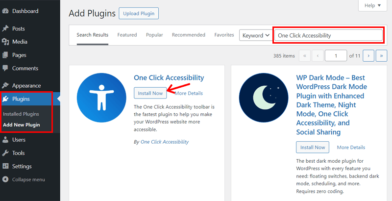
Upon installation and necessary configuration, your website gets a toolbar. This contains options like resize font, grayscale, negative contrast, high contrast, light background, links underline, readable font, etc.

Now, your visitors no matter which disability they may have can access your web content by utilizing the available features. Hence, you can simply install such a plugin to make your website accessible. Great, isn’t it?
18. Test with Assistive Technology
Following that, you must test your site’s compatibility with popular assistive technologies. Assistive technologies are tools and devices that let people with disabilities interact with digital content. So, this lets you confirm that your site works perfectly fine on them.
For example, you can check if your site gives a seamless experience for visually impaired users with screen readers. So, you can test it on JAWS or NVDA. Another way is to use browser extensions like ChromeVox or Fangs to simulate the experience.
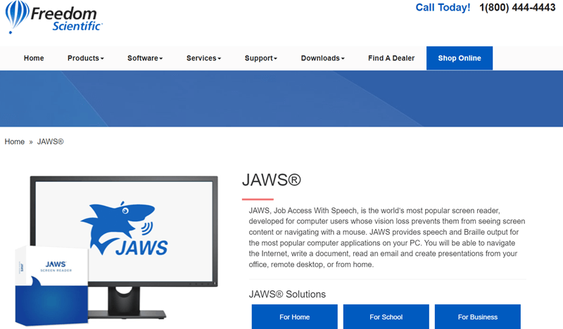
Similarly, other technologies may include magnifiers, voice recognition software, etc. Testing on all of them, you can identify and resolve accessibility issues related to semantic HTML, labeling of elements, form controls, website navigation, etc.
19. Stay Informed and Update Regularly
After checking your website on assistive technologies, your work is not done. First, you can utilize online tools that let you go through an accessibility audit.
For example, we suggest using WAVE (Web Accessibility Evaluation Tool) and accessiBe. They provide detailed reports on most of your accessibility features.

Similarly, there are tools available for checking specific features as well. For instance, WebAIM’s Contrast Checker helps you find color contrast issues. Also, the Keyboard Accessibility Checker lets you find keyboard navigation issues.
Best of all, you must regularly check and update your website to comply with the latest accessibility standards. Also, you can conduct user testing with individuals of varying abilities. Now, you can gain valuable insights and recognize areas that require improvement.
Frequently Asked Questions (FAQs)
Still, having questions? Here are some FAQs to solve your remaining confusion:
1. Are there specific considerations for mobile accessibility?
Yes, there are specific considerations for mobile accessibility you should know. That includes mobile-friendly design, touch-friendly controls, responsive layouts, etc.
2. Are there tools available to check my website for accessibility?
Yes, of course, there are tools like WAVE and accessScan that help you check your website for accessibility. All you need to do is insert your webpage on these tools and get reports.
3. What are the legal requirements for website accessibility?
Legal requirements for website accessibility vary by country. However, WCAG guidelines are the most widely used worldwide. In the US, the ADA Act may also apply.
4. How can I stay updated on web accessibility best practices?
5. What are some common barriers to web accessibility?
Some common barriers to web accessibility include lack of alt text, poor navigation, inaccessible multimedia content, non-semantic HTML, etc.
6. Which company can help to make our website accessibility ready?
Many companies help in making accessible sites and among them, we strongly recommend going with WPMount. Basically, it offers a complete solution for web development.
Starting your first website? Learn how to create a website from scratch here!
Conclusion
That’s all we have here on how to make your website accessible. Hopefully, you understood all the techniques we discussed in this guide.
In a nutshell, making your website accessible is not just a legal requirement. But it focuses on ensuring inclusivity and equal access for all users.
This guide came up with 19 tips to help you create an accessible website. But remember that accessibility is an ongoing process requiring you to stay informed about evolving standards and technologies.
Did we forget to mention a technique that you’re aware of? If yes, then mention them. You can also share your queries in the comment section.
Until we reply to you with the answers, read our other articles on how to get more Google reviews on your business and how to make money online.
Lastly, follow us on Facebook and Twitter to connect with us on social media.
